

A beautifully designed home can still feel unsettled when too many decorative objects compete for attention. The problem is rarely the quality of the individual pieces. It is usually the absence of hierarchy, proportion and enough space around them.
This is one of the most important differences between decorating a room and styling it. Decorating often begins with the question, "What else can I add?" Interior styling asks a different question: "What does this room still need?"
In a refined luxury interior, every surface does not need to be filled. A coffee table can hold three carefully considered objects instead of ten. A console can support one important sculpture rather than an entire collection. Open shelves can contain deliberate gaps. These quieter areas allow the objects that remain to have greater presence.
The objective is not minimalism. A home can be layered, expressive and personal without becoming visually crowded. The skill lies in deciding what deserves attention, what should support it and what should be removed.
This guide explains how to style luxury home decor with that sense of restraint: starting with the room, creating visual hierarchy, using negative space, composing different surfaces and knowing when an interior has enough.
Table of Contents
- Luxury Is Not the Same as More
- Start with the Room, Not the Accessories
- Create a Clear Visual Hierarchy
- Why Negative Space Makes Luxury Decor More Powerful
- Style Surfaces Without Filling Them
- Mix Objects by Height, Form and Material
- Use Repetition Without Making the Room Look Matched
- How to Know When to Stop Decorating
- Styling Small Homes Without Visual Clutter
- A Simple Room-by-Room Styling Checklist
- Frequently Asked Questions
Luxury Is Not the Same as More
One of the easiest mistakes in luxury home decor is assuming that an expensive interior needs many expensive objects. It does not.
In many Indian homes, the interior may already contain several visually expressive layers through stone, timber, textiles, artwork, lighting and furniture. In such rooms, decorative accessories often need to quieten the composition rather than introduce another competing statement.
A handcrafted vase, a sculptural object, a designer clock, a decorative bowl and a beautifully produced coffee table book may each deserve a place in the home. But when several statement pieces are placed together without hierarchy, their individual character begins to disappear.
The eye needs somewhere to rest.
Think about a large coffee table. Placing decorative objects across its entire surface may make it look complete when viewed object by object, but from across the room it can become one continuous field of visual information. Instead, grouping a few objects in one area and deliberately leaving another part of the table open creates contrast between the styled and unstyled space.
The objects become easier to notice because they are no longer competing with everything around them. This principle becomes even more important when the room already contains visually strong elements: richly veined marble, patterned rugs, statement lighting, artwork, textured curtains or distinctive furniture. Decor has to respond to that existing visual weight rather than simply add another layer on top.
A luxurious interior therefore does not depend on how much has been added. It depends on how carefully everything has been edited.
Start with the Room, Not the Accessories
Before styling a room, step away from the accessories and look at the room itself.
What already attracts attention? It may be a large artwork, an expressive chandelier, a marble wall, a view through full-height windows, an unusual piece of furniture or simply the scale of the room. These elements already contribute to the visual composition before a vase or sculpture is introduced.
Next, look at the quieter areas. Perhaps a long console feels unfinished. A coffee table needs a point of interest. A shelving unit has several identical horizontal lines. An empty corner needs height. These are genuine styling needs.
Accessories should answer those needs. A tall vase with branches can introduce vertical movement into a room dominated by low furniture. A sculptural object can give identity to an otherwise quiet console. A stack of books can create height beneath a smaller object. A decorative bowl can introduce a low, horizontal form where another tall accessory would feel repetitive.
The broader principles of choosing scale, materials, colour and different types of accessories are explored in our complete guide to luxury home decor accessories for Indian homes. The styling decision comes after that selection: once you have beautiful objects, how should they share the room without overwhelming it?
This room-first approach prevents a common problem: buying something beautiful and then searching for somewhere to put it. When the room identifies the need first, the accessory has a reason to be there.
Create a Clear Visual Hierarchy
Not every decorative object in a room should demand the same amount of attention. A well-styled interior usually has a hierarchy. One element leads, several elements support it, and quieter objects help connect the composition.
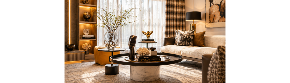
Consider the living room shown in the article image. The large transparent vase and branches create the strongest vertical decorative gesture. On the main coffee table, books provide a horizontal base while a sculptural object introduces height. A smaller bowl remains deliberately quiet. On the shelving behind, objects are separated rather than packed together.
Each accessory is doing something different. If the vase, sculpture, bowl, books and shelf objects were all similar in size and visual strength, the composition would become flatter. Nothing would clearly lead the eye.
Hierarchy can be created through several qualities:
Scale: one larger object can lead while smaller pieces support it.
Height: varying heights prevent a group from becoming one continuous horizontal line.
Colour: a contrasting object naturally attracts more attention than one that blends into the palette.
Material: reflective glass, polished metal or crystal can become more visually prominent than matte stone or ceramic.
Placement: an object surrounded by open space often commands more attention than a similar object placed among several others.
You do not need to use all of these forms of contrast together. In fact, doing so can make the object too dominant. Often one or two are enough.
Navin Kanodia's Perspective
When I style a room, I don't begin by asking how many accessories it needs. I first decide where I want the eye to go. Once that is clear, every other object either supports that focal point, connects it to another part of the room or stays deliberately quiet. That hierarchy is what prevents a layered interior from becoming a cluttered one.
Why Negative Space Makes Luxury Decor More Powerful
Negative space is the area around an object that has deliberately been left unoccupied.
It may be the empty section of a console beside a sculpture, the space between objects on a shelf, the unstyled half of a coffee table or even a section of wall without artwork.
It is not wasted space. Negative space allows the eye to separate one object from another. It makes silhouettes easier to read, materials easier to appreciate and important pieces more noticeable.
Imagine a sculptural glass vase placed alone on a generous side table. You notice its outline, transparency, reflections and the way it interacts with light. Add several smaller objects tightly around it and those qualities become harder to see.
The same principle applies to shelving. A shelf does not become better styled because every available centimetre contains something. Leaving part of a shelf open can make the objects beside that space appear more deliberate.
This becomes particularly valuable in luxury interiors because many decorative pieces derive their character from craftsmanship, material and form. They need enough visual room for those qualities to be appreciated.
Negative space also creates rhythm across a room. The eye moves from an object to an open area, then towards another composition. Without those pauses, several individually beautiful arrangements can merge into visual noise.
This does not mean every luxury home should look sparse. A collector's home can contain many objects and still feel sophisticated. The principle remains the same: create groups, establish hierarchy and allow some separation between visual moments.
Style Surfaces Without Filling Them
Different surfaces have different functions, and they should not all be styled in the same way.
Coffee Tables
A coffee table is viewed both from across the room and from close range, so its styling needs to work at both distances.
Begin with one composition rather than distributing small objects evenly across the entire table. Books can create a base. A sculptural object, bowl or smaller decorative piece can introduce another level. Flowers or branches may provide height if they do not interfere with conversation or sightlines.
Then leave part of the table empty. That open area is visually useful and also allows the table to remain functional.
Console Tables
A console often benefits from stronger vertical relationships because it is normally viewed against a wall. A sculpture, vase, mirror or artwork can establish the principal element. Smaller objects can then support it without creating a continuous row from one end of the console to the other.
Asymmetry often works particularly well. A tall object on one side does not necessarily need an equally tall object on the other. Visual balance can come from a group of smaller pieces, a lamp or even the open space itself.
Open Shelves
Shelves become cluttered quickly because every level appears to offer another opportunity for decoration. Resist the urge to fill each one.
Vary the composition from shelf to shelf. One might contain a single sculptural object. Another may combine books and a small decorative piece. A third can remain much quieter. The entire shelving unit should be read as one composition rather than as several unrelated shelves that each need to be completed.
Side Tables
Side tables are usually smaller and functional, so their styling should be particularly restrained. A table lamp may already provide enough visual presence. If another object is needed, one small bowl, book or decorative piece is often sufficient.
Luxury styling is not about proving that every surface has been considered by placing something on it. Sometimes the clearest sign that a surface has been considered is that part of it has intentionally been left alone.
Mix Objects by Height, Form and Material
A group of decorative objects becomes interesting when the pieces have a relationship without looking identical.
Height is one of the simplest places to begin.
If every object on a coffee table or console finishes at approximately the same level, the arrangement can feel flat. Introduce one taller form, one medium-height element and something lower, and the eye begins to move through the composition.
This does not mean arranging accessories mechanically from tallest to shortest. The variation should feel natural. A decorative vase can provide height. A sculpture or art object can introduce a more irregular silhouette. A decorative bowl creates a lower, quieter form. Together, these differences give the arrangement rhythm without requiring many pieces.
Form matters in the same way. If the furniture and interior contain many straight lines, a rounded vase, curved sculpture or organic object can soften the composition. If the room already contains many rounded forms, something more structured can provide useful contrast.
Materials can also create relationships across the room. Glass may echo the transparency of a nearby table. Bronze can connect with the finish of a lamp. A stone object may relate to a marble surface without matching it exactly. Timber can introduce warmth into an interior dominated by harder materials.
The objective is not to create as many contrasts as possible. It is to make sure the objects are not all contributing the same visual quality.
Even coffee table books contribute to this composition. Their rectangular form provides a useful counterpoint to rounded bowls, irregular sculptures and organic vases, while also creating different levels on which smaller objects can be placed.
When height, form and material are varied thoughtfully, a small number of accessories can create far more depth than a larger collection of similar objects.
Use Repetition Without Making the Room Look Matched
A room feels connected when certain ideas appear more than once. The mistake is assuming that repetition means matching.
If a living room contains a bronze floor lamp, you do not necessarily need bronze vases, bronze sculptures and bronze bowls. Repeating the finish everywhere can make the styling feel coordinated rather than collected. Instead, repeat more subtly. This is where the distinction between blending, connecting and contrasting becomes useful. An accessory does not need to repeat an existing finish exactly; it can simply connect two elements already present in the room.
A bronze detail on one object may connect with a lamp across the room. Black can appear in a coffee table frame, the base of a sculpture and a picture frame. Warm amber glass can relate to timber without being the same colour. A curved form introduced in a vase may be echoed by the shape of a chair or lamp.
These relationships may not be immediately obvious, but they help the room feel coherent. Repetition can also happen through mood rather than material. Several objects from different makers can belong together because they share an organic quality, a restrained palette or a similar degree of visual simplicity.
This is particularly useful when a home contains objects collected over time. Everything does not need to come from the same collection or designer. In fact, allowing some variation often gives the interior more personality. The aim is connection without uniformity.
How to Know When to Stop Decorating
Knowing when to stop is one of the most valuable skills in interior styling. Once a room begins to look good, there is often a temptation to keep improving it by adding one more object.
That is usually the moment to step away. Look at the room from its entrance rather than standing beside the surface you have just styled. From a distance, you can see whether several areas are competing for attention.
Then ask a few simple questions.
Is there a clear place for the eye to go first?
Does every important object have enough space around it?
Are several surfaces trying to become focal points at the same time?
Have I added something because the room needed it, or because there was an empty space?
Would removing one object make another object look better?
That last question is particularly useful.
Editing does not necessarily mean removing everything until the room becomes minimal. It means removing the pieces that weaken the objects you actually want to notice.
Navin Kanodia's Perspective
I often find that the final stage of styling is not adding something but taking something away. If removing an accessory makes the object beside it more beautiful, improves the silhouette of the furniture or gives the room a calmer rhythm, the room did not need that extra piece.
Photographing the room can also help. A photograph compresses the interior into a single frame and often makes clutter easier to recognise than when you are standing inside the space.
A finished room should still contain places where nothing is asking for attention.
Styling Small Homes Without Visual Clutter
Small apartments do not necessarily need smaller decorative objects. In fact, filling a compact room with many miniature accessories can make it appear more cluttered because the eye has to process a greater number of individual elements.
One well-proportioned vase or sculpture can often create more impact with less visual noise. The difference is that every object in a smaller room needs to earn its place more carefully.
Use vertical surfaces when table space is limited. Artwork, mirrors and clocks can introduce character without occupying another horizontal surface. A tall vase can use a narrow footprint while creating height. Books can provide both visual interest and a base for another object rather than requiring a separate decorative piece.
Functional objects can also contribute to the styling. A beautiful tray can organise smaller items. A bowl can remain decorative while still having a purpose. A carefully chosen table lamp provides both light and sculptural presence.
Be particularly selective with open shelves in compact homes. Several shelves filled with small objects can quickly become the busiest part of the room. Larger pieces, fewer groupings and deliberate gaps usually create greater calm.
Scale should still relate to the furniture. A large object can work in a small room when it has enough visual space around it; an oversized object surrounded by other oversized pieces will not.
The principle is therefore not "use small decor in small homes". It is use fewer objects with clearer purpose.
A Simple Room-by-Room Styling Checklist
Once the main styling is complete, walk through the room once more and look at the complete composition rather than individual accessories.
1. Identify the focal point.
Can you tell what the room wants you to notice first?
2. Check the major surfaces.
Do the coffee table, console, side tables and shelves each have a different level of visual intensity, or is every surface equally decorated?
3. Look at height.
Does the room contain enough variation between low, medium and taller decorative elements?
4. Look at silhouettes.
Can you clearly see the shape of important objects, or are neighbouring accessories interrupting them?
5. Check repetition.
Are colours, materials or forms connected subtly across the room without appearing excessively matched?
6. Protect negative space.
Are there areas of tables, shelves, walls and floors that have deliberately been allowed to remain quiet?
7. Remove one thing.
Temporarily take away the least important accessory in a composition. If the arrangement becomes stronger, leave it out.
8. Check function.
Can people still place a cup on the coffee table, use the side table, open a cabinet and move comfortably through the room?
This final editing process is often what separates a room that has been decorated from one that feels professionally styled.
Luxury Home Decor Should Feel Collected, Not Crowded
A sophisticated interior does not reveal its value through the number of decorative objects it contains.
It reveals it through judgement. The right luxury home decor accessories can introduce craftsmanship, personality, colour, texture and meaning to a room. But their impact depends on what happens around them.
A vase needs enough space for its silhouette to be seen. A sculpture needs a position where its form can be appreciated. Books need to contribute to the composition rather than simply accumulate. Even candles and fragrance objects should belong to the surface on which they are placed rather than becoming another category that must be added everywhere.
For this reason, curation and editing are inseparable. Choose objects because they contribute something the room needs. Give important pieces enough space to matter. Create hierarchy rather than allowing every accessory to compete. Repeat colours and materials subtly. And when the room begins to feel balanced, resist the assumption that an empty area still needs to be filled.
That restraint is not an absence of decoration. It is part of the decoration.
Frequently Asked Questions
How do I make my home look luxurious without overdecorating it?
Begin with fewer, better-chosen objects and create a clear visual hierarchy. Allow one or two elements to lead the room, vary height and form, and leave enough negative space around important pieces. Luxury comes from proportion, craftsmanship and thoughtful placement rather than the number of accessories displayed.
How many decorative objects should I put on a coffee table?
There is no fixed number because the size of the table and visual weight of the objects matter more than quantity. A small grouping of books, a sculptural object and a bowl or vase may be enough on a generous table, provided part of the surface remains open and usable.
Should every empty surface have decor on it?
No. An empty area can provide important negative space and help neighbouring objects stand out. Filling every table, shelf and corner often makes an interior feel busier rather than more complete.
Should home decor accessories match each other?
They do not need to match. Look instead for subtle relationships through colour, material, form or mood. Objects from different designers and collections can work together beautifully when something connects them without making the arrangement appear coordinated as a set.
How do I stop shelves from looking cluttered?
Treat the entire shelving unit as one composition. Vary what happens on each shelf, use some larger objects instead of many small ones, combine books with sculptural pieces and deliberately leave some areas open.
Are large decorative objects suitable for small apartments?
Yes. One well-proportioned statement object can create greater impact and less visual clutter than several small accessories. The important considerations are its relationship with the furniture, available space and the amount of visual breathing room around it.
How do I know when a room is overdecorated?
A room may be overdecorated when several surfaces compete equally for attention, important objects lose their individual presence or there is nowhere for the eye to rest. Try removing the least important object from each busy composition. If the room becomes clearer and calmer, it probably contained more than it needed.
Author
Navin Kanodia is the Co-founder and Design Director of Spacio, with extensive experience in luxury home decor, decorative lighting and interior styling for contemporary Indian homes. His approach to styling focuses on proportion, curation, material relationships and the use of negative space to create interiors that feel layered without becoming visually crowded.
Explore Luxury Home Decor at Spacio
Discover curated vases, sculptures, decorative objects, books and accessories selected for contemporary luxury interiors.


