
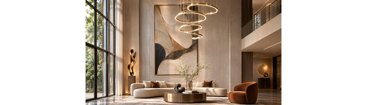

A double-height wall can be one of the most striking features in a home, but its scale also makes it difficult to style. A small artwork may disappear against the height, while too many decorative elements can make the wall feel crowded. The key is to create a strong vertical composition that relates to the room below it, rather than treating the entire wall as empty space that needs to be filled.
In a double-height living room, entrance hall or open-plan interior, the wall needs to be considered from different distances and levels. It may be viewed from the seating area, from a staircase, from an upper landing or from the entrance. A successful composition brings these viewpoints together through scale, proportion, visual balance and carefully chosen materials.
Interior stylist Navin Kanodia approaches a large wall as part of the complete room. The aim is not to decorate every available section, but to decide where the eye should travel, which element should lead the composition and how the remaining space should support it. This is what helps a double-height wall feel intentional rather than empty or overdecorated.
- Choose one dominant visual element, such as oversized art, a mural or a sculptural installation.
- Use the full vertical height thoughtfully, rather than concentrating every object at eye level.
- Relate the wall composition to the furniture, flooring, ceiling and other finishes in the room.
- Use lighting to reveal the artwork, surface or sculpture without creating glare or visual clutter.
- Keep enough negative space around the main feature so that the composition can be appreciated.
In This Article
- Understanding the Double-Height Wall
- Start with the Room, Not the Wall
- The Art of Vertical Composition
- Choose One Dominant Element
- Oversized Wall Art: Creating a Strong Focal Point
- Murals and Decorative Wall Surfaces
- Sculptural Wall Installations and Dimensional Objects
- Lighting a Double-Height Wall
- Layering, Balance and Negative Space
- Common Mistakes to Avoid
- Styling Double-Height Walls in Different Spaces
- Considerations for Indian Homes
- An Interior Stylist’s Perspective
- Frequently Asked Questions
Understanding the Double-Height Wall
A double-height wall is a wall that extends across two levels of a building, creating a much taller volume than a conventional room. It is commonly found in duplex apartments, villas, bungalows, penthouses and homes with double-height entrance halls or living rooms. The open volume can bring a sense of space and grandeur, but it also changes how the wall is seen and experienced.
Unlike a standard wall, a double-height wall is rarely viewed from one fixed position. Someone sitting on a sofa may see its lower portion, while a person standing on an upper landing may look across the upper section. The wall may also form part of the first view when entering the home. Its design therefore needs to work from several viewpoints, not just from the centre of the room.
There is also a difference between making a tall wall visually interesting and making it visually busy. Height alone does not demand more decoration. A single large artwork, a carefully composed mural or a well-proportioned sculptural feature may have a stronger presence than a collection of unrelated objects spread across the surface.
The most important decision is to understand what the wall needs to contribute to the room. It might act as the main focal point, connect two levels visually, reinforce the character of the interior or provide a backdrop for the furniture below. Once its role is clear, the choice of art, surface treatment, sculpture and lighting becomes easier.
Start with the Room, Not the Wall
One of the common mistakes in styling a double-height wall is to make decisions by looking at the wall in isolation. A large blank surface can seem to call for a large decorative feature, but the right solution depends on the complete room. The furniture arrangement, ceiling height, windows, staircase, flooring, colour palette and natural light all influence how the wall should be treated.
Look at the main viewing position
Begin by identifying where people are most likely to see the wall. In a living room, the main view may be from the sofa or from the entrance. In a foyer, the wall may be seen while walking towards the staircase or from the upper floor. These positions affect the size, height and placement of the main feature.
A composition that looks balanced from the ground floor may appear too low when viewed from an upper landing. Equally, placing the main artwork too high can make it feel disconnected from the furniture and the people using the room. The design should acknowledge both levels, while still establishing a clear focal point.
Consider the furniture and the floor area
The wall should have a visual relationship with the furniture below it. A large sofa, a pair of statement chairs or a console table creates a horizontal base. The wall treatment can provide a counterpoint to this horizontal arrangement through height, vertical movement or a carefully placed focal element.
For example, an oversized artwork above a long sofa may create a strong connection between the seating area and the tall wall. A mural can establish a larger visual field, while a sculptural installation can introduce depth and movement. The choice should relate to the furniture's scale and visual weight, rather than simply matching its width.
Read the architecture and natural light
Windows, balconies, staircases, beams and ceiling details can all influence the wall composition. A tall window may already create a strong vertical feature, while a staircase can introduce a diagonal line that changes the way the wall is perceived. These elements should be considered as part of the design rather than treated as obstacles to decoration.
Natural light is equally important. A wall that receives strong daylight may reveal the texture of a mural or surface treatment differently from a wall that remains in shade. Reflective materials can change in appearance as the light moves through the day. Before choosing a finish, consider how the wall will look in daylight as well as in the evening.
Stand at the main entrance, sit in the principal seating position and view the wall from the upper level if one is accessible. These three viewpoints often reveal whether the proposed composition is too low, too high or visually disconnected from the room.
The Art of Vertical Composition
Vertical composition is the central design challenge of a double-height wall. The eye needs a reason to move upwards, but that movement should feel natural. A wall can look unfinished when all its visual interest is concentrated close to the floor. It can feel overwhelming when every section is filled with artwork, surface detail or decorative objects.
A useful approach is to think of the wall as a composition with a beginning, a centre and a visual finish. The lower section may connect with furniture or the room's activity. The central area can hold the main artwork or focal feature. The upper section can extend the visual movement through the height of the wall, or remain relatively quiet so that the main feature retains its importance.
Use scale to establish presence
Scale is not simply a matter of choosing the largest object available. It is about selecting an element that has enough visual presence to relate to the height and width of the wall. A small framed picture may be beautifully made, but on a very tall surface it can appear isolated unless it is deliberately part of a larger arrangement.
Oversized artwork, large-format murals and substantial sculptural features can work well because they are visible from a distance. Their size gives the eye a clear point of focus. However, the element must still relate to the room's proportions. An artwork that overwhelms the seating area or competes with a large window may create a different imbalance.
Create a visual path
The composition should guide the eye rather than make it jump between unrelated objects. This can be achieved through a tall artwork, a mural with a natural upward movement, a sequence of sculptural elements or lighting that draws attention to a particular section of the wall.
Repetition can also create rhythm. A carefully spaced arrangement of framed works, for instance, may lead the eye upwards. The spacing, proportions and relationship between the pieces need to be consistent enough to read as one composition. Randomly placing objects at different heights rarely achieves the same effect.
Do not fill the entire height by default
A double-height wall does not have to be decorated from floor to ceiling. Leaving part of the surface quiet can make the main feature feel more significant. The upper portion may need only a subtle continuation of the composition, or no additional treatment at all.
This restraint is particularly important when the room already contains strong visual elements such as a dramatic staircase, a chandelier, large windows or richly textured furniture. The wall should contribute to the overall experience, not compete with every other feature.
Choose One Dominant Element
Before selecting individual objects, decide what will lead the composition. This dominant element gives the wall its identity and helps the other design choices fall into place. It could be an oversized artwork, a bespoke mural, a sculptural installation or a distinctive wall surface.
There is no single solution for every double-height space. A contemporary living room may benefit from a large abstract artwork, while a home with a more expressive interior could support a mural or a combination of art and sculpture. A tall entrance hall may call for a different treatment from the wall behind a seating arrangement.
Once the main element is chosen, consider what should support it. Secondary artwork, surface texture, lighting and nearby objects should strengthen the central idea. They should not introduce competing focal points. This is the difference between a layered wall and a collection of unrelated decorative features.
Oversized Wall Art: Creating a Strong Focal Point
Large-scale wall art is one of the most direct ways to give a double-height wall a clear identity. A single substantial artwork can establish a focal point without requiring several smaller pieces. It can introduce colour, subject, movement and personality while giving the wall a defined centre.
The artwork may be an abstract composition, a figurative work, a landscape, a photographic image or a carefully selected masterpiece. The subject matters, but so does the way the artwork relates to the room. Its colour palette can connect with the furniture and soft furnishings, while its scale can balance the height of the wall.
One large artwork or a group of smaller works?
A single oversized artwork often creates a stronger and calmer focal point. It is especially useful when the room already has a number of distinctive features. A group of smaller works can work when the intention is to create a gallery-like arrangement, but the composition needs to be planned as one complete unit.
For a double-height wall, a gallery arrangement should have a clear outer shape and a consistent visual rhythm. The relationship between frame sizes, spacing, subject matter and colour needs to be considered together. Without this discipline, the collection can look scattered across the wall rather than deliberately composed.
For different approaches to selecting artwork, including size, composition, material and placement, see the guide to choosing wall art for luxury homes, offices and commercial spaces.
Explore wall art prints and paintings and masterpieces from artists around the world when considering artwork for a large statement wall.
Murals and Decorative Wall Surfaces
A mural offers a different approach to a double-height wall. Rather than placing an artwork on the surface, it makes the wall itself the visual composition. This can be particularly effective when the wall is large enough to support a continuous image or when the design needs to connect the lower and upper levels of a room.
A mural can create a sense of movement, depth or atmosphere. Depending on the design, it may introduce a landscape, an artistic pattern, an abstract composition or a more expressive visual scene. Its scale allows the image to be experienced from a distance, while details can be appreciated closer to the wall.
Choose a mural that suits the height
The image should be selected with the wall's proportions in mind. A design that works well on a conventional wall may not translate naturally to a much taller surface. Look at how the composition is arranged vertically, where the strongest visual elements fall and whether the image remains balanced when viewed from different levels.
Large-scale patterns also need careful consideration. Repeated motifs can create rhythm, but a dense pattern across a very tall wall may become visually tiring. A more open composition may allow the eye to travel through the height without competing with the rest of the interior.
Let the wall surface contribute to the room
Not every double-height wall needs a figurative mural. A specialist wall covering or textured surface can create interest through material, colour and depth. The surface may become the main feature, with artwork or sculpture used sparingly, or it may provide a quieter background for another focal element.
Italian fresco can also be considered when a double-height wall calls for a more expressive surface treatment. Modern, 3D and Classical Italian Fresco offer different visual approaches, from contemporary compositions to dimensional effects and classical artistic styles. The choice should relate to the wall's scale, the room's character and the artwork, sculpture or lighting around it. Read Spacio's guide to Modern, 3D and Classical Italian Fresco walls for a closer look at these treatments.
Explore wallpaper art murals and art surface coverings as options for creating a more continuous treatment across a large wall.
The wider principles of choosing and combining wall treatments are covered in the complete guide to luxury wall styling and statement walls. It provides the broader context for understanding how murals, wall coverings, art, sculpture and lighting can work together.
Sculptural Wall Installations and Dimensional Objects
Art does not have to remain flat against the wall. Sculptural elements can introduce depth, shadow and a sense of movement that is particularly effective in a double-height space. Their three-dimensional form creates changing visual effects as the viewer moves around the room and as the light changes during the day.
A sculptural wall installation may become the principal feature of the composition, or it may work alongside a mural or textured surface. Metal, glass, crystal, wood and mixed-media objects each bring a different visual character. Metal can introduce structure and reflection, glass can create transparency, crystal can catch light, while wood can bring warmth and a more grounded material presence.
Think beyond a single decorative object
A double-height wall may have enough scale to support an installation rather than one isolated object. A group of related sculptures can create a vertical rhythm, particularly when their sizes and spacing are planned together. The arrangement should have a recognisable visual structure, even when the individual pieces are different.
However, more objects do not necessarily create a stronger installation. The relationship between their forms, materials, visual weight and negative space matters more than the number of pieces. A few well-positioned sculptural elements can have greater impact than a dense arrangement that competes with the room.
Coordinate sculpture with the wall surface
The background is important when working with dimensional objects. A highly detailed mural may compete with a complex sculptural installation, while a quieter surface can allow the objects to stand out. Conversely, a restrained sculptural arrangement may work well against a richly textured wall because the two elements contribute different kinds of visual interest.
For a closer look at material choices, explore sculptures and art objects, including glass sculptures, crystal sculptures and metal sculptures.
Lighting a Double-Height Wall
Lighting can change how a double-height wall is experienced. During the day, natural light reveals colour, texture and material. In the evening, carefully planned lighting can bring attention to artwork, emphasise a surface or make a sculptural installation more visible. It also helps connect the wall to the wider lighting scheme of the room.
The important distinction is between lighting that reveals the wall and lighting that competes with it. A large decorative chandelier may already be a major visual feature in a double-height living room. If the wall also contains a dramatic mural, oversized artwork and several illuminated objects, the space may have too many competing focal points.
Use light to reveal art and texture
Focused lighting can help an artwork become visible from across the room. It can also bring out the texture of a wall covering or reveal the depth of a sculptural surface. The position and direction of the light should be considered in relation to the artwork, the wall finish and the main viewing positions.
For textured and reflective surfaces, the direction of light is especially important. Light falling across a surface can reveal its relief and create shadows, while direct light on a reflective finish may produce glare. The desired effect should be considered before choosing the lighting position.
Decorative lighting can itself become part of a double-height wall composition. A pair of wall lights, a vertically arranged lighting feature or a distinctive sculptural fitting can introduce rhythm and visual balance. The fitting should relate to the wall's proportions and the other decorative elements rather than being selected only for its appearance.
In some rooms, the chandelier or pendant light is already the dominant vertical feature. In these cases, the wall treatment may need to be quieter. In other spaces, the wall may be the main feature and the lighting can be used more discreetly to reveal it.
The aim is to create a relationship between the wall, the decorative lighting and the room's general illumination. Each should have a clear role, with no single layer unnecessarily overpowering the others.
Layering, Balance and Negative Space
A successful double-height wall often combines more than one material or decorative element. A mural may provide the background, artwork may create a focal point, sculpture may introduce depth and lighting may reveal the details. This layering can make the wall feel richer and more considered, but only when the elements have a clear order of importance.
Establish visual hierarchy
Visual hierarchy means deciding which element should attract attention first, which should support it and which should remain in the background. On a double-height wall, this decision is particularly important because the large surface can accommodate several treatments.
For example, a mural may be the dominant element, with a small number of sculptures adding depth. In another composition, a large artwork may lead, while a textured wall covering provides a quieter background. The arrangement should make it clear which element is the focal point rather than asking every component to attract equal attention.
Use contrast with intention
Contrast can be created through colour, material, shape, texture and scale. A dark sculptural object against a lighter surface may create a strong focal point. Glass against a textured background can introduce a contrast between transparency and visual weight. Metal against a warmer material can bring a different balance of reflection and softness.
These contrasts work best when they relate to the wider interior. Repeating a material or colour elsewhere in the room can help the wall feel connected to the furniture, flooring or lighting. The intention is not to match everything, but to create a sense of continuity.
Allow the wall to breathe
Negative space is the unoccupied area around the artwork, sculpture or other focal elements. It is not wasted space. It gives the eye room to appreciate each feature and helps the main composition stand out.
On a double-height wall, negative space is especially valuable because the sheer size of the surface can tempt people to add more objects. Leaving a portion of the wall untreated can make the selected elements appear more substantial. It also prevents the composition from becoming visually tiring.
When a wall feels unfinished, first ask whether the main element is correctly scaled and positioned. Adding more objects may not solve the problem. Sometimes the answer is a stronger focal point, better lighting or a more deliberate relationship between the wall and the furniture below it.
Common Mistakes to Avoid When Styling a Double-Height Wall
The scale of a double-height wall can make small design decisions more noticeable. A composition that appears balanced on paper may feel disconnected once viewed from the room. These are some common mistakes worth considering before finalising the design.
1. Using artwork that is too small
A small artwork placed alone on a very tall wall can appear lost. It may be an attractive piece, but its scale may not be sufficient to establish a focal point. Consider a larger work, a planned gallery arrangement or a combination of art and sculpture that creates a more substantial composition.
2. Placing everything at eye level
Decorative elements arranged only at the lower level can leave the upper wall disconnected. The solution is not necessarily to fill the entire height. Instead, consider how the composition can extend upwards through the scale of the artwork, the direction of a mural, a vertical sculptural arrangement or lighting.
3. Filling every section of the wall
Adding artwork, mirrors, sculptures, wall coverings and decorative lights without a clear hierarchy can make the wall feel crowded. Choose a dominant element first and allow the supporting details to remain secondary. Not every available section needs a decorative object.
4. Ignoring the room below
A wall treatment that looks impressive on its own may feel disconnected from the furniture and activity below it. Consider the width of the seating arrangement, the visual weight of the furniture, the floor finish and the lighting. The wall should feel like part of the room, not a separate display.
5. Creating too many focal points
A dramatic chandelier, a large mural, oversized art and a complex sculpture may each be attractive individually. Together, however, they may compete for attention. Decide which feature should lead and allow the others to support it.
6. Treating lighting as an afterthought
Lighting can affect how colours, textures and reflective materials appear. If it is considered only after the wall has been completed, the final effect may not be what was intended. Think about the relationship between the surface, the artwork and the lighting during the initial composition.
7. Forgetting installation and maintenance
Large artworks and sculptural installations need to be planned with their mounting, weight, access and maintenance in mind. A double-height wall can make installation and future cleaning more difficult, especially where the feature is positioned well above normal reach. The appropriate fixing and installation method should be confirmed with qualified professionals and the relevant product or material supplier.
Styling Double-Height Walls in Different Spaces
Although double-height walls are often associated with living rooms, they can appear in several parts of a home. Their treatment should reflect how each space is used, where people view the wall from and the atmosphere the room needs to create.
Double-height living rooms
The living room is often the most expressive space for a double-height wall. It may be seen from the entrance, the main seating area and an upper floor. A large artwork, mural or sculptural installation can create a focal point behind or beside the seating arrangement.
The composition should relate to the sofa, chairs, coffee table and decorative lighting. If the room already has a statement chandelier, the wall treatment can provide a complementary feature rather than competing with it. A considered balance between the horizontal seating arrangement and the vertical wall composition is especially important.
Explore Spacio's living room collection for further inspiration when considering how the wall treatment relates to the furniture and wider room setting.
Decorative lighting as part of the composition
For more inspiration on creating a focal point behind the seating area, explore living room wall decor and statement walls behind the sofa.
Double-height entrance halls and foyers
An entrance hall often creates the first impression of a home. A tall wall can provide an opportunity for a distinctive artwork, a mural or a sculptural feature that establishes the character of the interior from the moment someone enters.
The composition should be understood from the entrance door and the route through the space. If a staircase or upper landing is visible, the wall should also relate to those viewpoints. A carefully placed mirror, sculpture or artwork can create a strong arrival experience without making the entrance feel crowded.
Explore ideas for entrance foyer styling when considering how the wall connects with the surrounding space.
Double-height dining spaces
In a dining area, the wall contributes to the atmosphere around the table. A mural, artwork or textured surface can create a backdrop for dining and entertaining. The position of the dining table, pendant lighting and other furniture should guide the scale and placement of the wall feature.
A large wall does not necessarily need several decorative elements. A single artwork or a restrained combination of surface treatment and lighting may create a more composed setting. For further ideas, read about dining room wall styling with art, mirrors, lighting, murals and fresco.
Double-height staircases and upper landings
A staircase creates a distinctive viewing experience because the wall is seen while moving between levels. The composition can follow the direction of the staircase through a sequence of artworks, a continuous mural or a carefully planned sculptural arrangement.
The important consideration is how the composition appears from both the lower and upper levels. A design that works from the ground floor should not look incomplete when viewed from the landing. Installation access and safe fixing also need to be considered, particularly for large or heavy elements.
Considerations for Double-Height Walls in Indian Homes
Double-height spaces are found in Indian villas, bungalows, duplex apartments, penthouses and larger residential developments. The design challenge is not only the height of the wall, but also how it relates to the scale and layout of the home. A double-height living room in a compact urban duplex may need a different approach from a large villa with an expansive entrance hall.
In apartments, the wall may share its visual field with balconies, staircases, large windows and open-plan living or dining areas. The composition needs to connect these elements without making the space feel fragmented. In a villa or bungalow, the wall may have more room for a large mural, artwork or sculptural installation, but the same principles of proportion and restraint still apply.
Natural light also varies according to the direction of the windows, the surrounding buildings and the depth of the room. A reflective surface that looks striking in a shaded space may behave differently in strong afternoon sunlight. It is useful to consider the wall at different times of day before deciding on the finish and lighting.
Practical planning matters as much as appearance. Large artworks, wall coverings and sculptural elements may require specialist installation. Access equipment, fixing conditions, cleaning requirements and the ability to maintain the feature over time should be considered before the final selection is made.
An Interior Stylist’s Perspective: Making Height Feel Intentional
For interior stylist Navin Kanodia, the challenge of a double-height wall is not simply how to fill a large surface. It is how to give that surface a role within the room. A wall can be visually impressive yet still feel disconnected if its scale, materials and focal point do not relate to the space around it.
The first decision should be the visual anchor. Once that is established, the surrounding elements can be selected to support it. Artwork may introduce colour and subject, a mural may create continuity, sculpture may bring depth, and lighting may reveal the material and form. Each element should have a reason to be there.
It is equally important to know when to stop. A double-height wall has a natural sense of scale and presence. It does not need to be filled simply because it is large. The most successful compositions often combine one strong idea with carefully chosen supporting details and enough open space for the whole arrangement to be appreciated.
Frequently Asked Questions
How do you decorate a double-height wall without making it look empty?
Start with one dominant feature that has enough scale to relate to the height of the wall. This could be oversized artwork, a mural or a sculptural installation. Consider how it connects with the furniture below and the upper level. Supporting elements and lighting can complete the composition, while leaving some areas of the wall open.
What kind of artwork works best on a double-height wall?
Large-format artwork, oversized abstract compositions, figurative art and carefully planned gallery arrangements can all work. The right choice depends on the wall's proportions, the room's colour palette and the main viewing positions. A single large work often creates a calmer focal point, while a group of smaller works needs careful spacing and a clear overall composition.
Should a double-height wall be decorated from floor to ceiling?
No. The full height does not need to be covered. A well-scaled artwork or installation can create sufficient visual presence without filling every section. Negative space helps the main feature stand out and prevents the wall from becoming overdecorated.
Can you combine a mural, wall art and sculpture on a double-height wall?
Yes, provided the elements have a clear visual hierarchy. A mural can act as the background, artwork can establish a focal point and sculpture can introduce depth. However, if all three elements are equally prominent, the wall may feel crowded. Their scale, colour, material and placement should be planned as one composition.
How should lighting be planned for a double-height wall?
Lighting should be considered alongside the wall treatment, artwork and sculpture. It can reveal texture, draw attention to an artwork or create depth through light and shadow. The direction and intensity of light should be assessed to avoid glare, particularly on reflective materials. The overall lighting scheme should also relate to any statement chandelier or pendant in the room.
Where can I buy luxury wall art, sculptures and wall styling products for double height walls in Mumbai?
You can explore Spacio's collections of wall art, sculptures, decorative objects and specialist wall surfaces at its Mumbai store at 3BK, Laxmi Industrial Estate, New Link Road, Andheri West, Mumbai 400 053. Customers can also discuss their interior styling requirements and explore ideas for statement walls with the team. Find the Spacio Mumbai store.
Where can I shop luxury wall styling products and interior styling solutions for double height walls in Kolkata?
Spacio's Kolkata store is located at 86B Topsia Road South, Kolkata 700 046. Customers can explore wall art, sculptures, decor accessories and other luxury interior collections, and discuss interior styling requirements for their homes and projects. Find the Spacio Kolkata store.


