
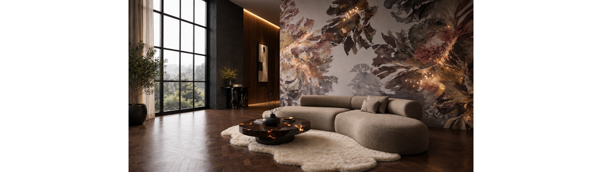

A large wall can be one of the most powerful architectural surfaces in a home, but it can also be one of the most difficult to style. When a wall is unusually wide, unusually tall or simply left blank, the instinct is often to fill it. That is usually the wrong starting point.
The better question is: what should this wall contribute to the room? A large or empty wall may need one oversized artwork, a broad mural, a sculptural composition, an expressive wall covering, a decorative mirror, carefully positioned lighting or a combination of several elements. In some cases, it may need surprisingly little decoration and considerably more attention to scale and negative space.
Styling a large wall successfully is therefore less about finding enough wall decor and more about understanding scale, proportion, visual weight, hierarchy, architecture, lighting and space. The objective is to make the wall feel intentionally designed rather than simply occupied.
This is particularly important in luxury interiors. A small artwork placed on a very large wall can look disconnected from the architecture. Conversely, covering every available section with artwork, mirrors or decorative objects can make a large wall feel crowded rather than sophisticated. The strongest compositions establish a clear visual hierarchy and allow the wall, furniture and architecture to work together.
In this guide, I explain how I approach large and empty walls through the principles of wall styling, including how to judge the size of a wall, when to use oversized wall art, when a mural or surface treatment makes more sense, how sculpture and mirrors change the composition, how lighting helps a large wall after dark, and why leaving part of a wall empty can sometimes be the most deliberate design decision.
Table of Contents
- Why Large and Empty Walls Are Difficult to Style
- Start With the Wall, Not the Decoration
- How to Read the Scale and Proportion of a Large Wall
- The Relationship Between a Large Wall and Furniture
- Decide What the Wall Should Do
- Surface-Led or Object-Led: Which Direction Should You Take?
- When Oversized Wall Art Is the Right Solution
- How Large Should Wall Art Be on a Large Wall?
- One Large Artwork or a Group of Smaller Pieces?
- When a Wall Mural Makes More Sense Than Artwork
- Using Wall Sculptures to Give a Large Wall Dimension
- Using Decorative Mirrors on a Large Wall
- Why Negative Space Is Essential
- How to Layer a Large Wall Without Overdecorating
- How Lighting Changes a Large Wall
- How Lighting Changes a Large Wall
- When LED & Crystal Wallpaper Can Transform a Large Empty Wall
- How to Style a Very Wide Wall
- How to Style a Very Wide Wall
- How to Style a Tall or High Wall
- How to Approach a Double-Height Wall
- How to Style a Long Wall Without Making It Look Repetitive
- What to Do When Doors, Windows, Niches or Columns Interrupt the Wall
- When One Dominant Element Is Enough
- The Surface Behind the Art Matters
- Common Mistakes When Styling a Large or Empty Wall
- A Practical Large-Wall Styling Decision Framework
- Styling Large Walls in Indian Homes
- How Spacio Approaches a Large or Empty Wall
- An Interior Stylist's Perspective on Large Walls
- Frequently Asked Questions About Styling Large or Empty Walls
- The Goal Is a Designed Wall, Not a Filled Wall
Why Large and Empty Walls Are Difficult to Style
A large wall creates a very different design problem from a small decorative wall. The eye experiences the wall as a broad plane before it notices individual objects placed upon it. If the object is too small, it can appear lost. If the treatment is too fragmented, the wall can feel visually restless. If everything is concentrated in one area without considering the surrounding architecture, the composition can appear accidental.
This is why simply searching for large wall decor ideas does not necessarily solve the problem. A large wall needs a response to its physical scale. The solution might be one large piece of wall art, a continuous mural, a sculptural installation, a textured or artistic surface, a carefully arranged group of artworks or a combination of surface and object.
The wall also has to coexist with everything around it. A living-room wall may sit behind a sofa. A dining wall may need to relate to a dining table and pendant light. A foyer wall may be viewed from several directions. A double-height wall may be visible from a considerable distance. A long corridor wall is experienced while moving through the space rather than from one fixed viewing position.
So the question is not simply “How do I decorate a blank wall?” It is “How do I give this particular wall the correct visual scale and role within the room?”
Why filling the wall is often the wrong solution
There is a natural psychological response to a large blank surface: fill it. But negative space is not evidence of an unfinished interior. It can be an intentional part of the composition.
A wall with one substantial artwork and generous surrounding space can feel more resolved than a wall containing ten smaller objects. A broad mural can make an entire wall feel complete without requiring additional decoration. A sculptural piece may need substantial breathing room so that its form and shadow remain visible. A mirror may need open space around it to make its reflection meaningful.
Luxury wall styling therefore begins with editing. The question is not how much can fit onto the wall, but how much the room actually needs. This large-wall problem sits within the broader discipline of luxury wall styling, where architecture, surface, art, sculpture, mirrors, lighting, scale and negative space are considered as one composition. For the wider framework, see Spacio's complete guide to luxury wall styling and statement walls in Indian interiors.
Start With the Wall, Not the Decoration
Before choosing artwork, wallpaper, sculpture or mirrors, study the wall as an architectural element.
Look at its width and height. Notice whether it is uninterrupted or broken by doors, windows, niches, columns or changes in level. Consider what is directly opposite it and how far away the viewer normally stands. Look at the furniture in front of it and identify whether the wall is meant to support that furniture or establish an independent focal point.
Then consider the surrounding walls. A large wall does not exist in isolation. If the adjacent surfaces are already visually strong, the large wall may need restraint. If the entire room is quiet, the wall may be an opportunity for a more substantial statement.
This is the first principle I use when approaching an empty wall: the size of the wall tells you how much visual presence the composition needs, but it does not tell you how many objects you need.
— Navin Kanodia, Interior Stylist
How to Read the Scale and Proportion of a Large Wall
Scale and proportion are often used together, but they describe different relationships.
Scale concerns how large an element feels in relation to the surrounding space. Proportion concerns the relationship between the dimensions of elements within the composition. A large artwork may have the correct scale for a large wall but still feel poorly proportioned if its shape conflicts with the wall, furniture or architectural openings.
For a large wall, assess at least five dimensions:
- Wall width: determines the horizontal presence available to the composition.
- Wall height: determines whether the composition needs stronger vertical presence.
- Furniture width: establishes an important visual reference below the wall.
- Viewing distance: affects how large an artwork or sculptural element needs to feel from normal viewpoints.
- Architectural interruptions: doors, windows, niches and other elements change the usable visual field.
A wall that is ten metres wide should not automatically receive ten metres of decoration. But a composition intended to occupy only a small central portion of it may feel visually weak if the room is large and the viewing distance is substantial.
This is where proportion becomes more useful than simple measurement. Imagine the wall and its intended artwork together as one composition. Does the artwork feel anchored? Does it relate to the furniture below? Is there sufficient visual presence on either side? Does the upper portion of the wall feel intentionally resolved? Is there a reason for the empty areas to remain empty?
Large wall does not mean oversized everything
One of the most common mistakes is assuming that a large wall requires every element to become large.
That can create a room where the artwork, sculpture, lighting, furniture and decorative accessories all compete for attention. Instead, scale should be distributed. One element can provide the dominant scale while supporting elements remain quieter.
For example, a substantial artwork may establish the primary visual weight while a pair of smaller decorative lights provides rhythm. Alternatively, an expressive mural can occupy the entire surface while the artwork placed in front of it is reduced or eliminated. A large sculptural installation may require a quiet background and generous negative space rather than additional wall decoration.
The Relationship Between a Large Wall and Furniture
Furniture is one of the most important reference points when styling a large wall because it establishes the lower scale of the composition.
A wall behind a sofa, console, bed, dining table or sideboard should not be treated as an independent rectangle. The furniture below it creates a horizontal visual line. The wall treatment needs to relate to that line in terms of width, height and visual weight.
If the artwork is dramatically narrower than the furniture, it may feel isolated unless there is a deliberate reason for that contrast. If the artwork is extremely broad and heavy while the furniture below is visually delicate, the wall may dominate the room. Neither relationship is automatically wrong; the issue is whether the difference is intentional.
Behind a sofa
A broad wall behind a sofa often benefits from a composition that acknowledges the width of the seating. This does not necessarily mean placing one artwork exactly above the centre of the sofa. Depending on the room, the wall could use a broad artwork, a sequence of works, a mural, sculpture, a surface treatment or a layered arrangement.
The important point is that the wall should visually belong to the seating area. If the wall treatment is too small, the sofa can appear disconnected from the wall. If the wall treatment is too dominant, the seating can become secondary.
Above a console or sideboard
A console creates another useful horizontal reference. A single substantial artwork or mirror can establish a clear vertical relationship with the furniture, while decorative lighting or smaller objects can provide secondary rhythm.
For a luxury interior, this relationship is often more successful than treating the entire wall as an empty canvas for multiple unrelated objects.
Decide What the Wall Should Do
Before selecting a wall treatment, define the job of the wall. A large wall can perform several different visual functions:
| Wall role | What the wall needs to achieve | Possible styling direction |
|---|---|---|
| Create a focal point | Give the room one clear visual anchor | Oversized wall art, sculpture, mirror or strong surface treatment |
| Add atmosphere | Change the mood and material character of the room | Mural, artistic surface, fresco, textured treatment or controlled lighting |
| Introduce personality | Bring art, culture or individual expression into the interior | Wall art, collected works or sculptural objects |
| Strengthen architecture | Make a large architectural plane feel intentional | Large-format surface treatment, mural, fresco or vertically scaled artwork |
| Create depth | Introduce reflection, shadow or dimensional variation | Mirrors, sculpture, textured surfaces and lighting |
| Connect separate elements | Bring furniture, materials and architecture into one visual composition | Layered wall styling using surface, art, sculpture and light |
This decision prevents a common problem: selecting an attractive wall product before understanding why the wall needs it.
For example, if the wall already has a strong architectural finish, another expressive surface may not be necessary. If the wall is visually plain but the room needs personality, artwork may be the stronger direction. If the wall is extremely broad and the objective is immersion rather than a focal object, a mural or continuous artistic surface may be more appropriate.
Surface-Led or Object-Led: Which Direction Should You Take?
One of the most useful decisions for a large wall is whether the wall should be surface-led or object-led.
A surface-led wall derives most of its visual identity from the wall itself. Wallpaper, artistic wall coverings, murals, Italian fresco and other specialist surface treatments can establish the visual field before any object is introduced.
An object-led wall uses the surface primarily as a backdrop for a significant piece or group of objects. Large-scale wall art, sculpture, decorative mirrors and selected combinations can create this type of composition.
| Approach | Best suited to | Primary visual effect |
|---|---|---|
| Surface-led | Walls where the architecture benefits from continuous visual treatment | Immersion, continuity, texture, colour or imagery |
| Object-led | Walls where one artwork or sculptural element deserves attention | Focal point, personality and visual hierarchy |
| Layered | Walls requiring both a strong background and foreground element | Depth, contrast and controlled complexity |
The layered approach requires the most discipline because the surface and object have to share the visual field without becoming competing focal points.
When Oversized Wall Art Is the Right Solution
Oversized wall art is often the simplest answer to a large blank wall when the room needs a strong focal point without changing the entire wall surface. The advantage of a large artwork is concentration. Instead of distributing visual information across the entire wall, it gives the eye one substantial point of focus. This can make a large wall feel resolved while preserving areas of negative space around the artwork.
Large-format wall art can be particularly effective when the artwork has enough visual character to hold its own against the architecture. A quiet room may support a stronger artwork. A room already containing expressive materials may require something more restrained.
Spacio's Wall Art Prints & Paintings collection is relevant when the wall needs artwork as the principal visual element. For a more dimensional direction, the Wall Art, Sculptures & Murals collection brings together several forms of wall-focused visual expression.
What makes oversized art work?
Oversized art works when its presence is proportionate to the wall and its visual language belongs to the room. That means considering more than physical dimensions. Look at the artwork's colour density, contrast, subject matter, framing, material, orientation and visual weight. A physically large but visually quiet artwork may behave very differently from a similarly sized work with strong contrast and dense imagery.
The surrounding wall also matters. An artwork can appear larger when surrounded by quiet space. Conversely, placing several visually strong objects around it can reduce its dominance even if the artwork itself is substantial.
How Large Should Wall Art Be on a Large Wall?
There is no single universal percentage that can determine the correct size of artwork for every large wall. The right proportion depends on the wall, the furniture, the viewing distance, the artwork itself and the visual weight of the room.
Instead of applying a rigid formula, use a visual test: does the artwork have enough presence to belong to the architecture without overwhelming the elements around it?
Start by viewing the wall from the normal position from which the room is experienced. A piece that looks appropriately large when standing close to it may appear surprisingly small from across a large living room. Conversely, an artwork that fills the field of view at close range may dominate the room from normal viewing distance.
Also consider orientation. A very tall wall may favour a vertical composition. A broad horizontal wall may support a landscape-format artwork, a wide artwork arrangement or a continuous mural. But these are starting points rather than rules. Sometimes deliberately opposing the wall's geometry creates the stronger composition.
One Large Artwork or a Group of Smaller Pieces?
When faced with a large blank wall, homeowners often assume that multiple smaller artworks will provide more flexibility. Sometimes they do. But a large wall can also become visually fragmented when too many small pieces are used without a strong compositional structure.
One large artwork creates concentration. It is particularly effective when the artwork itself has enough presence and when the room benefits from a clear focal point.
A group of artworks can create rhythm, narrative and a more collected atmosphere. The individual pieces do not need to be identical, but they should have a reason for belonging together. That reason may come from colour, subject, material, frame treatment, scale or visual rhythm.
A gallery-style arrangement should therefore not be treated as a method of filling empty wall area. It is a composition in its own right.
When smaller works can work better
Multiple artworks can be useful when the wall is wide but the room benefits from horizontal rhythm. They can also work where the architecture already contains strong vertical divisions and the artwork sequence can reinforce those divisions.
But if the wall is enormous and uninterrupted, a collection of small pieces may simply create islands of decoration floating in a large field. In such situations, a larger artwork, continuous surface or more substantial sculptural intervention may create stronger architectural connection.
When a Wall Mural Makes More Sense Than Artwork
A mural solves a different problem from a painting. Where an artwork concentrates attention on one object, a mural can make the wall itself part of the visual story. This can be particularly effective on very broad walls where an individual artwork would leave substantial areas of unused visual field.
A mural can establish imagery, colour, depth or atmosphere across a larger architectural plane. It can also create visual continuity where the wall is intended to feel immersive rather than object-led. Spacio's Wallpaper Art & Murals collection is relevant when the objective is to transform the wall surface through imagery rather than simply place an artwork against it.
For a large wall, the most important consideration is not simply whether the mural is attractive. It is whether its composition works at the scale of the architecture. Imagery that feels balanced in a small sample may behave differently when extended across a substantial wall. The relationship between the visual centre of the mural, furniture and architectural openings therefore becomes critical.
A mural can solve visual emptiness without adding objects
This is one of the reasons murals are powerful for large walls. They can provide enough visual information to make the wall feel complete without requiring additional decorative objects to occupy the remaining space.
That does not mean every mural should cover every possible wall. If the room already contains strong artwork, sculpture, patterned furniture or highly expressive materials, an equally expressive mural may create too much competition. In that situation, a quieter surface or a carefully selected artwork may be more appropriate.
Using Wall Sculptures to Give a Large Wall Dimension
Wall sculpture introduces something that a flat artwork cannot: physical depth.
A sculptural wall element can create shadows, projection, texture and changing visual relationships as the viewer moves through the room. This makes sculpture particularly interesting for walls that feel empty not because they lack colour, but because they lack dimensionality.
Glass, crystal, metal, mixed media, Murano glass, ceramic, porcelain and wood can all create very different visual weights. Transparent or reflective materials can behave lightly even when physically substantial. Dense metal or wood can feel more grounded. A highly reflective sculptural piece may attract attention through light, while a matte sculptural form may rely more strongly on silhouette and shadow.
Spacio's Sculptures & Art Objects collection and its specialist sculpture categories provide different material directions for walls where three-dimensional art is more appropriate than a conventional flat artwork.
Why sculpture needs more breathing room
One of the mistakes with wall sculpture is treating it like a painting and surrounding it with too many additional objects.
Sculpture already creates visual information through depth, shadow and material. It often needs negative space around it to remain legible. If the wall behind it is highly patterned, the surrounding lighting is dramatic and several decorative objects are added nearby, the sculpture can lose the visual clarity that made it attractive in the first place.
For this reason, a large empty wall can sometimes be solved more elegantly by one substantial sculptural statement than by a collection of smaller decorative pieces.
Using Decorative Mirrors on a Large Wall
A mirror changes a large wall differently from artwork or sculpture because it introduces reflection.
This makes mirror placement a spatial decision as much as a decorative one. The question is not only whether the mirror fits the wall. It is what will the decorative mirror reflect? A well-positioned decorative mirror can reflect light, architecture, artwork, furniture or another visually meaningful part of the room. It can therefore connect the wall to its surroundings.
A poorly positioned mirror can simply reproduce visual clutter. If it reflects a television, a crowded passage, an uninteresting corner or competing decorative elements, its reflective quality may work against the composition.
Large mirror or composition of mirrors?
A single large mirror can provide a strong architectural presence, particularly when the room benefits from reflection and visual calm. Multiple mirrors can create rhythm, but they need to be composed rather than scattered.
The frame, shape, scale and spacing all influence the result. A collection of small mirrors may create a decorative pattern, while one large mirror may create a stronger visual plane.
The right decision depends on whether the wall needs reflection as the primary function or simply mirror elements as supporting details.
Why Negative Space Is Essential
Negative space is the area deliberately left visually quiet around and between elements. On a large wall, it is one of the most important tools for preventing the composition from becoming overloaded.
It is tempting to see empty areas as unfinished areas, particularly when the wall itself is very large. But negative space gives scale to the elements that are actually present. A large artwork appears more substantial when it has room around it. A sculpture becomes more legible when its silhouette is not competing with nearby objects. A decorative mirror becomes more meaningful when its reflection has visual clarity.
Negative space also creates hierarchy. When everything is visually active, nothing is clearly dominant. When some areas are quiet, the eye knows where to go.
— Navin Kanodia, Interior Stylist
This is particularly important in luxury interiors, where restraint often creates more visual authority than accumulation.
How to know when a large wall has enough decoration
Step away from the wall and look at it as part of the entire room. Ask three questions:
- Is there a clear element that the eye notices first?
- Do the secondary elements support that focal point rather than competing with it?
- Does enough quiet space remain for the composition to breathe?
If the answer to all three is yes, the wall may already be complete. Adding another decorative object simply because there is physical space available can weaken the result.
How to Layer a Large Wall Without Overdecorating
Layering can make a large wall more sophisticated, but it should never be confused with adding more things.
A layered wall has different visual responsibilities. One element establishes the background. Another establishes the focal point. A third may provide illumination, texture, reflection or rhythm.
For example, an artistic surface can provide the background while one large artwork creates the focal point. A mural can provide the visual field while a restrained sculptural element introduces dimension. A textured wall can be supported by decorative wall lighting that reveals its surface after dark.
The principle is simple: each layer should contribute something different.
| Layer | Primary role | Typical examples |
|---|---|---|
| Background | Establishes the visual field | Wallpaper, mural, artistic surface, fresco or restrained architectural finish |
| Anchor | Creates the primary focal point | Oversized artwork, sculpture, mirror or major wall installation |
| Supporting layer | Adds rhythm or secondary interest | Smaller artworks, selected objects or secondary sculptural elements |
| Atmospheric layer | Changes how the wall is experienced | Decorative wall lighting and controlled illumination |
| Negative space | Separates and gives importance to the other layers | Intentional visual quiet around and between elements |
The most important layer may therefore be the one that is not physically added at all: the space that remains quiet.
How Lighting Changes a Large Wall
A large wall should not be judged only in daylight.
Lighting can completely alter how artwork, sculpture, mirrors and textured surfaces are perceived after sunset. It can reveal dimensionality, create shadows, draw attention to a focal element or change the atmosphere of the room. This makes lighting part of the wall composition rather than a final decorative accessory.
For example, a sculptural piece may become more dimensional when its form creates shadows. A reflective surface may interact strongly with illumination. A textured wall covering may reveal depth that is less apparent in flat daylight. Decorative wall lights can also create vertical rhythm and provide an additional architectural layer.
Spacio's wall lights and decorative lighting collections can therefore be considered as part of the overall wall styling process rather than simply as functional lighting categories.
Light the focal point, not everything
A common mistake is to illuminate every element equally. This can flatten the hierarchy because everything receives the same visual importance.
Instead, consider which part of the wall should be noticed first and allow the lighting strategy to support that hierarchy. The objective is not maximum illumination. It is controlled visibility. This becomes particularly important when the wall already contains reflective materials, metallic surfaces, glass or crystal. The final lighting approach should be evaluated for the actual material and installation rather than assumed from a generic lighting rule.
The technical requirements of specialist illuminated wall treatments and decorative lighting should always be confirmed for the specific product and project. Visual intent can be planned at the design stage, but electrical provision, installation conditions and product-specific requirements should be verified before execution.
At this stage, the large-wall problem can be understood through one simple sequence:
Architecture → Wall Scale → Furniture Relationship → Wall Role → Dominant Element → Supporting Elements → Lighting → Negative Space → Final Editing.
The next step is to apply this sequence to the most common large-wall conditions: very wide walls, tall walls, double-height spaces, long walls, walls behind furniture and walls that need a statement without becoming visually heavy.
When LED & Crystal Wallpaper Can Transform a Large Empty Wall
A large wall does not always need a piece of artwork placed onto it. Sometimes the wall itself can become the artwork. LED & Crystal Wallpaper is one such approach, combining an illuminated wall surface with the visual effect of crystals to create a statement wall in which the wall treatment and illumination become part of the composition.
This makes LED and crystal wallpaper particularly relevant when a large or empty wall needs more than colour or pattern but does not necessarily need multiple objects attached to its surface. Instead of treating the wall as a blank background, the illuminated surface becomes the dominant layer.
Why LED & Crystal Wallpaper Works Differently on a Large Wall
On a large wall, a conventional decorative surface can sometimes feel visually static. An illuminated and crystal-enhanced surface introduces another dimension: the relationship between the wall and light itself. The surface can contribute texture, reflection, sparkle and atmosphere while still occupying the architectural scale of the wall.
According to Spacio's collection information, these wallpapers combine integrated LED lights with shimmering crystals and are customised to the required size. They are therefore not simply a conventional wallpaper pattern with decorative lighting placed in front of it; the illumination is part of the wall-covering concept itself.
This distinction matters when styling a large wall. The objective is not to add more decoration simply because the wall is large. It is to select a wall treatment capable of carrying the visual weight of the architecture.
Can LED & Crystal Wallpaper Be Combined With Wall Art?
Yes, but the relationship needs to be carefully controlled. The illuminated surface can act as the background layer while a framed artwork provides a more concentrated foreground focal point. This creates a different type of layered wall: the surface establishes atmosphere, while the artwork establishes subject and visual focus.
The two elements should not automatically receive equal visual emphasis. If the LED and crystal surface is already expressive, the artwork may need greater scale and a composition that can hold its position against the illuminated background. In other situations, the wall surface itself can remain the hero and the artwork can be omitted altogether.
This is one of the signature combinations within Spacio's wall-styling approach: an illuminated surface as the background and a controlled artwork as the foreground. The same principle can later be developed in greater detail when the wall-styling cycle addresses combining LED wallpaper with framed wall art.
When Should You Consider LED & Crystal Wallpaper?
It can be particularly compelling when a large wall is intended to create atmosphere as well as visual impact. It can work where a conventional artwork feels too small for the architectural scale, where the wall needs to remain visually engaging after dark, or where the interior calls for a more distinctive illuminated surface.
It is also useful to think about the wall's role before choosing it. If the room already contains several highly expressive decorative elements, an illuminated crystal surface may become too visually dominant. If the architecture is relatively restrained and the wall is intended to become the principal statement, the same treatment can provide the visual depth that the space needs.
How to Keep an Illuminated Wall From Becoming Overwhelming
The answer is hierarchy. An LED and crystal wall already contains light, surface detail and visual movement, so adding multiple equally strong artworks, mirrors, sculptures and decorative lights can dilute the effect.
Consider what the wall should communicate first. If the illuminated surface is the hero, give it sufficient negative space. If a major artwork is intended to lead, treat the illuminated surface as its supporting environment. If sculpture is introduced, its scale and shadow should strengthen the composition rather than compete with the light and crystal effect.
This is why LED & Crystal Wallpaper belongs within the broader discipline of wall styling rather than being treated simply as a specialised wallpaper product. Its success depends on how the surface interacts with everything around it.
The Day-and-Night Relationship
One of the most important considerations with an illuminated wall is that the composition has more than one visual state. During the day, the wallpaper's pattern, crystal elements and relationship with the surrounding interior may dominate. After dark, the illumination can become a much stronger part of the experience.
The wall should therefore be evaluated in both conditions. Artwork, furniture, adjacent lighting and reflective surfaces should all be considered in relation to the illuminated surface so that the evening composition remains intentional rather than becoming a completely different hierarchy.
How to Style a Very Wide Wall
A very wide wall creates a different challenge from a tall or double-height wall. Its visual weight extends horizontally, so a single small artwork placed at the centre can feel isolated rather than intentional. The composition needs enough horizontal presence to relate to the width of the architecture.
One approach is to use a single oversized artwork or wall treatment that has enough scale to hold the wall. Another is to create a horizontal composition using several related artworks, sculptures, mirrors or lighting elements. The important point is that the arrangement should be read as one composition rather than as unrelated objects distributed across a large surface.
For a wide wall, repetition can also establish rhythm. Repeated forms, materials or visual intervals help connect elements across the wall while maintaining negative space between them. This is particularly useful when the wall sits behind a long sofa, console or dining table.
Think in Terms of Horizontal Composition
A horizontal composition does not necessarily mean that every element must be arranged in one straight line. The arrangement can have variation in height, scale and depth while still having an overall horizontal reading.
For example, a dominant artwork can establish the centre of gravity while smaller sculptural or decorative elements extend the composition laterally. Decorative wall lighting can then help connect the composition after dark without competing with the primary element. The goal is to give the eye a clear path across the wall rather than leaving large visual gaps that make the wall feel unfinished.
How to Style a Tall or High Wall
High walls create almost the opposite problem. The horizontal composition may work well at furniture level, but a large amount of empty space can remain above it. Simply adding more objects higher up is rarely the best answer.
Instead, consider how the vertical dimension can become part of the design. A tall artwork, vertically oriented mural, elongated sculptural installation or deliberately scaled wall treatment can establish a stronger relationship with the height of the room.
The lower portion of the wall should still relate to the furniture and human scale. The upper portion can then extend the visual composition rather than becoming a separate decorative zone.
Use Vertical Scale Without Filling the Wall
A common mistake with tall walls is assuming that every empty area needs to be occupied. In luxury interiors, the opposite can often be more effective. A sufficiently large focal element can acknowledge the height of the wall while leaving deliberate negative space around it.
This is where proportion becomes more important than simply increasing the number of decorative objects. One well-scaled element can create greater visual authority than a collection of smaller pieces scattered across the entire height.
How to Approach a Double-Height Wall
A double-height wall needs to be considered as part of the architecture rather than as an oversized version of an ordinary feature wall. Its height, sightlines, furniture relationship and viewing distance all change the way the wall is experienced.
A strong composition may use one large artwork, a substantial mural or surface treatment, or a carefully designed combination of art, sculpture and lighting. The decision should begin with the architectural scale and the position from which the wall will normally be viewed.
A double-height wall does not automatically require decoration from floor to ceiling. The composition should have a visual centre, enough breathing room and a clear relationship with the lower-level furniture and circulation.
For a deeper exploration of this specific architectural condition, the wall-styling cycle also addresses double-height walls separately, because their proportions and installation considerations deserve more detailed treatment.
Use Furniture as a Scale Reference
A sofa, console or dining table gives the eye an immediate sense of scale. This makes it a useful reference when deciding whether a proposed wall element is substantial enough for the room.
For example, placing a small artwork above a large sofa can make both the artwork and the wall feel disconnected. Increasing the scale of the artwork, extending the composition laterally or introducing another supporting layer can create a stronger relationship.
This principle also applies when styling a wall behind a bed, console or dining table. The wall and furniture should be read together as one visual zone, even when the wall treatment extends beyond the furniture itself.
How to Style a Long Wall Without Making It Look Repetitive
Long walls, especially those extending through passages or connected living spaces, benefit from rhythm rather than random distribution. Repeating similar elements at regular intervals can sometimes make the wall feel institutional, while placing unrelated objects at arbitrary distances can make it feel unfinished.
A better approach is to create visual chapters. One section may carry a dominant artwork, another may introduce a sculpture or mirror, while lighting or material continuity connects the different moments.
The composition should still have an overall hierarchy. Not every section of a long wall needs to compete for attention.
This becomes particularly important in corridors and transitional spaces, where the experience is sequential rather than static. For a deeper look at styling walls in passages and corridors, see Spacio's dedicated guide to wall styling for these transitional spaces.
What to Do When Doors, Windows, Niches or Columns Interrupt the Wall
Large walls are rarely perfectly uninterrupted. Doors, windows, columns, niches, beams and openings can divide the available surface and make a straightforward centred composition impossible.
These architectural elements should not automatically be treated as obstacles. They can become part of the composition. A wall treatment can frame an opening, artwork can occupy an available panel of wall, or repeated elements can visually connect separated areas.
The key is to avoid pretending that the architecture is not there. Forcing a symmetrical arrangement onto an asymmetrical wall can create tension that feels accidental rather than designed.
Let the Composition Respond to the Architecture
When a column interrupts a wall, for example, the solution may involve treating the column as part of the visual rhythm rather than attempting to hide it. Similarly, a niche can become the location for a sculpture or another focal element instead of being left as unused space.
Windows and doors also establish natural boundaries. The wall composition should respect these boundaries and maintain enough breathing room around functional openings.
This is one of the reasons large-wall styling cannot be reduced to a single formula. The architecture changes the available canvas, the sightlines and the correct position of the visual anchor.
When One Dominant Element Is Enough
Not every large wall needs a layered installation. Sometimes the strongest solution is a single dominant element with enough scale, character and visual presence to hold the entire wall.
This could be an oversized artwork, a substantial sculptural piece, a mural or another distinctive wall treatment. The surrounding negative space becomes part of the composition rather than evidence that something is missing.
Choosing one anchor is particularly effective when the artwork or surface already contains considerable detail. Adding multiple competing elements can weaken the visual authority of the primary piece.
A Simple Test for the Dominant Element
Stand back and ask whether the main element has enough visual weight to establish the wall's identity. Then look at what remains around it. If the surrounding space feels intentional and balanced, additional decoration may not be necessary.
Luxury wall styling often comes from knowing when to stop.
Create Hierarchy Between the Layers
The question is not how many things can fit on the wall. It is which element should be noticed first, which should be discovered second and which should remain atmospheric.
If the mural is highly expressive, the artwork placed over it may need stronger scale but quieter visual language. If the sculpture is the hero, the surface behind it should support rather than compete with its form. This hierarchy is what turns a collection of wall products into a designed wall installation.
The Surface Behind the Art Matters
When artwork is placed on a large wall, the wall itself becomes part of the artwork's visual context. Colour, texture, pattern and reflectivity behind the piece can change how the artwork is perceived.
A quiet surface can allow a detailed artwork to dominate. A more expressive surface can create a layered composition, but it requires greater control over contrast, scale and visual density.
Spacio's art surface coverings and wallpaper, art and mural collections illustrate why the surface should be considered alongside the objects that will sit against it rather than selected as an unrelated finishing layer.
Design for Both Day and Night
A wall that looks balanced in daylight may become visually flat after sunset if its lighting has not been considered. Conversely, excessive illumination can flatten texture, create glare or make every element compete equally.
The objective is not simply to make the wall brighter. It is to decide what should remain visually important when the ambient light changes.
Common Mistakes When Styling a Large or Empty Wall
Choosing artwork that is too small. A large wall can make an otherwise attractive artwork appear insignificant. Scale should be considered in relation to both the wall and the furniture.
Filling every empty area. Empty space is not automatically a design problem. Negative space gives the primary elements room to breathe and helps establish hierarchy.
Creating multiple focal points. When every object is trying to be the hero, the wall loses clarity. Decide what should command attention first.
Ignoring the furniture below. A wall composition can be correctly scaled to the architecture and still feel wrong if it does not relate to the sofa, console, bed or dining table beneath it.
Adding lighting as an afterthought. Lighting changes how artwork, texture, sculpture and reflective materials are perceived. It deserves to be considered during the composition stage.
Copying an image without understanding its proportions. A wall styling image may look successful because of a particular ceiling height, furniture size, viewing distance or architectural condition. Reproducing the objects without reproducing those relationships rarely produces the same result.
Using a formula too rigidly. Scale and proportion provide useful principles, but every wall has a different architecture, viewpoint and visual context.
A Practical Large-Wall Styling Decision Framework
Before selecting artwork, wallpaper, sculpture, mirrors or lighting, work through the wall in this order:
- Read the architecture. Note the wall's width, height, openings, niches, columns and primary viewing positions.
- Identify the furniture relationship. Establish what sits below, beside or opposite the wall.
- Decide the wall's role. Should it be the main focal point, a supporting layer or a quieter architectural background?
- Choose the dominant element. Decide whether the anchor should be artwork, mural, sculpture, mirror, surface treatment or another wall feature.
- Set the scale. Make sure the dominant element has sufficient visual weight for the wall and room.
- Add supporting layers only where necessary. Introduce sculpture, secondary art, mirrors or decorative lighting when they strengthen the composition.
- Protect negative space. Do not add elements simply because empty wall remains visible.
- Consider lighting. Review how the composition will read in both natural and artificial light.
- Edit from a distance. Step back and assess the entire wall as one composition rather than judging each object individually.
This sequence keeps the decision anchored in design rather than in the number of products available.
Styling Large Walls in Indian Homes
Large walls appear in many types of Indian homes, from city apartments and larger residences to villas, duplexes, penthouses and homes with generous entrance or living spaces. The architectural scale can vary considerably, which makes proportion especially important.
In an apartment, for example, the wall may need to work closely with furniture and circulation because the overall room is more compact. In a villa or larger residence, the greater ceiling height and viewing distance may allow a more substantial artwork, mural or sculptural installation.
The principle remains the same: start with the architecture and the way the room is actually experienced, then select the wall treatment.
Indian interiors can also combine contemporary architecture with materials, craftsmanship and decorative traditions from different design languages. The wall should therefore support the character of the interior rather than follow a generic idea of what a “luxury wall” should look like.
How Spacio Approaches a Large or Empty Wall
At Spacio, wall styling is approached as a composition rather than as the selection of individual decor products. The starting point is the wall, its architecture and its relationship with the room. From there, the composition can move through surfaces, wall art, sculpture, mirrors and lighting depending on what the space requires.
For artwork-led walls, explore wall art prints and paintings. For a more dimensional composition, wall art, sculptures and murals bring together several of the specialist categories that can contribute to a statement wall.
Where the wall itself needs to become the primary visual layer, wallpaper, art and murals, art surface coverings and LED and crystal wallpaper provide different directions for developing the surface.
The purpose is not to use all these categories together. It is to understand which combination, if any, gives the particular wall the right hierarchy, depth and atmosphere.
An Interior Stylist's Perspective on Large Walls
Interior Stylist Navin Kanodia's approach to a large wall begins with a simple question: what does this wall need to do for the room?
That question shifts the process away from filling an empty surface and towards creating a relationship between architecture, furniture, wall treatment, objects, lighting and negative space.
A large wall can be quiet or dramatic, minimal or layered, artwork-led or surface-led. What makes it successful is not the quantity of decoration but the clarity of the composition and the way every major element relates to the space around it.
Frequently Asked Questions About Styling Large or Empty Walls
How do I decorate a very large blank wall?
Start by assessing the wall's width, height, architecture and relationship with nearby furniture. Then choose a dominant element such as oversized artwork, a mural, sculpture or a substantial wall treatment, adding supporting layers only when they improve the composition.
How do I make a large wall look less empty?
Do not begin by filling every visible gap. First check whether the existing focal element is large enough and correctly positioned. Increasing scale, extending the composition horizontally or introducing a considered secondary layer can make the wall feel more complete without overcrowding it.
What size art works on a large wall?
There is no single correct size. The artwork should be judged in relation to the wall, furniture, ceiling height, viewing distance and surrounding negative space. On a very large wall, an oversized artwork can often create a stronger visual relationship than several undersized pieces.
Is one large artwork better than several small pieces?
Either can work. One large artwork is often effective when it has enough visual presence to become the wall's anchor, while several smaller works can create rhythm and a broader composition when they are treated as one connected arrangement.
Should I use wallpaper or art on a large wall?
It depends on what role the wall needs to play. Wallpaper or another surface treatment can establish the background and atmosphere of the wall, while artwork can provide a more concentrated focal point. They can also work together when their visual hierarchy is carefully controlled.
Can sculpture work on a large blank wall?
Yes. Sculpture can give a large wall physical depth and introduce shadows, texture and three-dimensional presence. Its scale should relate to the architecture and furniture, and the background should support rather than compete with its form.
Are decorative mirrors good for large walls?
Mirrors can be effective when reflection is useful to the room and when their scale and placement are deliberate. On a large wall, mirrors can become part of a broader composition rather than simply functioning as standalone reflective objects.
How do I style a double-height wall?
Treat it as an architectural composition rather than simply enlarging a normal feature wall. Consider the full height, viewing distance, furniture relationship and sightlines, then choose a suitably scaled focal element while preserving deliberate negative space.
How do I style a large wall in a living room?
Begin with the sofa and the viewing position. The wall composition should have enough visual weight to relate to the sofa and room scale, with artwork, surface treatments, sculpture, mirrors or lighting selected according to the role the wall needs to play.
Where can I explore wall styling options at Spacio Mumbai?
If you are looking for wall art, sculptures, art surface coverings, decorative lighting or other luxury wall styling elements in Mumbai, you can visit the Spacio Mumbai Store at 3BK, Laxmi Industrial Estate, New Link Road, Andheri West, Mumbai – 400053. The showroom offers an opportunity to experience materials, artworks, sculptures and decorative pieces in person and discuss styling requirements with the Spacio team. Find Spacio Mumbai stores on Google Maps.
Where can I explore wall styling options at Spacio Kolkata?
If you are looking for wall art, sculptures, decorative lighting, furniture or other luxury interior elements in Kolkata, you can visit the Spacio Kolkata Store at Spacio Towers, 86B, Topsia Road (South), Kolkata 700046. The showroom allows homeowners, architects, interior designers and interior stylists to experience the collections and discuss interior styling requirements with the Spacio team. Find Spacio Kolkata store on Google Maps.
The Goal Is a Designed Wall, Not a Filled Wall
A large or empty wall becomes easier to style once the problem is viewed through scale, proportion and hierarchy rather than decoration alone.
The strongest solution may be one oversized artwork, a mural, a sculptural installation, a considered combination of materials or simply a powerful surface with enough negative space around it. The right answer depends on the architecture and the role the wall needs to play in the room.
Ultimately, successful wall styling connects architecture, scale, furniture, surface, art, sculpture, lighting and negative space into one composition. That is what turns an empty wall into a statement wall—and a collection of individual elements into a designed interior experience.


