
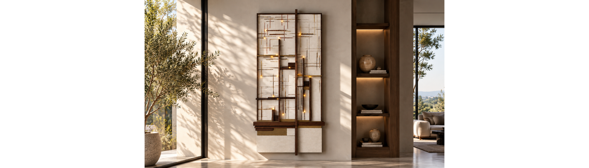

Choosing wall art for a luxury home is not simply about finding an artwork that you like. The artwork needs to work with the scale of the wall, the furniture below it, the proportions of the room, the surrounding materials and the amount of visual attention already present in the space.
The right wall art can become the visual anchor of a room. The wrong size, placement or composition can make an otherwise beautifully designed interior feel unbalanced. For this reason, wall art selection is best approached as a styling decision. Before choosing a frame, image, finish or artist, first understand the wall and the room it belongs to. Size establishes presence, composition controls visual rhythm, material changes how the artwork interacts with light, and placement determines how naturally it sits within the interior.
This guide explains how to choose wall art for a luxury home, including how to judge scale, choose between one artwork and a group, compare framed art with aluminium panels and other formats, consider masterpieces and sculpture, and place the final composition in relation to furniture and interiors.
If you are looking at the decision from a wider wall-design perspective, Wall Styling: A Complete Guide to Creating Luxury Statement Walls in Indian Interiors provides the broader framework for understanding how art works alongside wall coverings, murals, sculpture, lighting, mirrors and other wall treatments.
Wall art should be selected in relation to the room, not simply the empty wall. I look first at the interiors, furniture, proportions and existing visual weight of the space. Only then do I consider what the wall needs — a single artwork, a group of works, a dimensional sculpture or another treatment. This keeps the artwork connected to the interior rather than making it look like something added after the room was designed.
Table of Contents
- What Makes Wall Art Work in a Luxury Interior?
- Read the Wall Before Choosing the Artwork
- Start with Size: How Large Should Wall Art Be?
- Use Furniture to Establish the Artwork Scale
- When One Large Artwork Works Best
- When to Use Multiple Artworks
- How to Build a Balanced Wall Art Composition
- Choosing the Right Material and Finish
- Framed and Printed Art
- Aluminium Art Panels
- When Framed LED & Crystal Wallpaper Can Work as Wall Art
- Artist Masterpieces
- When Wall Sculpture Is a Better Choice
- Where Should Wall Art Be Placed?
- Choosing Wall Art by Room
- How Lighting Changes Wall Art
- Let the Artwork Speak to the Materials Around It
- Common Wall Art Selection Mistakes
- A Practical Wall Art Selection Framework
- How Spacio Approaches Wall Art
- Frequently Asked Questions
- Choosing Wall Art as Part of the Room
What Makes Wall Art Work in a Luxury Interior?
Luxury wall art is not defined only by its price, the fame of the artist or the richness of its frame. Its success comes from how convincingly it belongs to the interior. A strong artwork can have considerable visual presence without overwhelming the room. It can introduce colour into a restrained interior, bring contrast to a tonal scheme, add depth to a plain surface or create a focal point where the interior needs one. In another room, the artwork may deliberately remain quieter, supporting the furniture and materials rather than competing with them.
This is why the same artwork can look exceptional in one room and poorly scaled in another. The artwork itself has not changed. The relationship around it has.
When choosing wall art, consider six relationships:
- Wall to artwork: Does the artwork have enough presence for the available wall area?
- Artwork to furniture: Does its width and visual weight relate to the furniture beneath it?
- Artwork to room: Does it belong to the scale and character of the space?
- Artwork to material: Does the frame, print surface or panel finish work with nearby materials?
- Artwork to light: Will natural and artificial light reveal it properly without unwanted glare?
- Artwork to negative space: Is there enough breathing room around the composition?
These relationships are more useful than choosing artwork simply because its colour matches the sofa or because the wall looks empty.
Read the Wall Before Choosing the Artwork
The first step in choosing wall art is to study the wall as part of the room rather than viewing it as an empty rectangle. Look at its width and height. Notice whether it sits above a sofa, console, bed, dining table or desk. Check whether doors, windows, niches, columns or other architectural features interrupt it. Consider what can be seen from the main entrance to the room and from the principal seating position.
A wide wall can support a broad horizontal artwork or a carefully arranged group. A narrow wall may benefit from a vertical composition. A tall wall can accommodate a stronger vertical gesture, while a low wall above furniture may need an artwork with greater horizontal presence.
The wall surface matters too. A quiet painted wall gives artwork a different setting from a textured surface, patterned wallpaper or a more visually active material. If the background already carries strong colour, texture or pattern, the artwork may need more restraint. On a quieter surface, the artwork can take a stronger visual role. This is the first distinction between filling a wall and styling a wall. Filling responds to available space. Styling responds to the entire composition.
Start with Size: How Large Should Wall Art Be?
Size is one of the most important decisions in wall art selection because the human eye reads the artwork in relation to everything around it.
An artwork that is too small can appear disconnected from the furniture and leave the wall feeling unfinished. An artwork that is too large can dominate the room and make the furniture beneath it appear visually weak. For a luxury interior, the goal is usually not to maximise the amount of wall covered. It is to establish the right visual weight.
Wall Art Size & Height Guide
These measurements are useful starting points rather than fixed rules. The final position should respond to the furniture, wall height, artwork proportions, viewing position and visual weight of the room. Above furniture, the relationship between the artwork and the furniture should take priority over a fixed floor measurement.
| Wall Art Situation | Suggested Artwork Size | Suggested Height from Floor | Styling Guidance |
|---|---|---|---|
| Single artwork on an open wall | Choose a size that occupies roughly 50–70% of the available wall width | Centre of artwork around 145–155 cm from the floor | Use the centre of the artwork as the main height reference rather than its top edge. |
| Artwork above a sofa | Ideally around 2/3 of the sofa width | Bottom of artwork around 15–25 cm above the sofa | Keep the artwork visually connected to the sofa rather than floating too high on the wall. |
| Artwork above a console | Around 2/3 to 3/4 of the console width | Bottom of artwork around 15–25 cm above the console | Leave enough breathing space for objects on the console without creating a disconnected gap. |
| Large statement artwork | Approximately 60–80% of the available wall width, depending on the composition | Centre around 145–155 cm from the floor, adjusted for the room | Allow the artwork to remain the dominant visual element. Avoid adding unnecessary objects around it. |
| Gallery wall or multiple artworks | Treat the complete arrangement as one visual composition | Centre of the overall grouping around 145–155 cm from the floor | Measure the height of the entire composition, not each individual frame. |
| Artwork in a dining area | Scale to the dining table, wall and room proportions | Usually 15–25 cm above nearby furniture where applicable | Consider seated sightlines and keep the composition connected to the dining setting. |
| Artwork in a foyer or passage | Usually a narrower or vertically proportioned piece works well | Centre around 145–155 cm from the floor | Consider the viewing distance and movement through the space before choosing the scale. |
One useful rule: When artwork is being placed above furniture, the relationship between the artwork and the furniture usually matters more than a fixed measurement from the floor. When the artwork stands alone, the centre-point height becomes a more useful starting reference.
Start by considering the width of the furniture below the artwork. A substantial sofa, console or sideboard can support a stronger artwork than a small occasional table. The artwork does not need to mirror the furniture exactly, but the two should feel connected in scale. For example, a large sofa with a very small framed print centred above it may leave excessive empty space at either side. The problem is not that the artwork is unattractive. It is that its scale is too weak for the visual weight below it.
Conversely, placing an enormous artwork above a delicate console can create an imbalance in which the wall element becomes the only thing the eye notices. Think in terms of proportion rather than fixed measurements. There is no single artwork size that works above every sofa or console. The correct scale depends on the width, height, depth and visual character of the furniture, as well as the surrounding wall and interiors
Use Furniture to Establish the Artwork Scale
Furniture is one of the most useful reference points when judging artwork scale. When an artwork is positioned above a sofa, the sofa establishes a horizontal visual line. The artwork should feel anchored to that line rather than floating independently on the wall.
The same principle applies to a console in an entrance foyer, a sideboard in a dining room or a desk in a home office. The furniture below creates a visual base from which the wall composition can be developed.
There are several questions worth asking before finalising the artwork:
- Does the artwork have enough width to relate to the furniture below?
- Does its height leave comfortable negative space around the composition?
- Does the artwork feel visually heavier or lighter than the furniture?
- Will nearby lamps, accessories or architectural features compete with it?
- Does the artwork sit naturally within the sightline of people using the room?
These questions are especially important in Indian homes where living rooms and dining areas can vary significantly in scale, from compact urban apartments to large villas, duplexes and penthouses. The same artwork strategy cannot simply be transferred from one room to another without considering proportion.
When One Large Artwork Works Best
One large artwork can create a strong focal point without requiring a complicated arrangement. This approach works particularly well when the room already contains several visual elements and the wall benefits from a clear anchor. A large artwork can provide hierarchy: the eye knows where to look first, while the furniture, lighting and accessories become supporting elements.
A single large artwork is also useful when the architecture itself is strong. In a refined room, there may be little need to divide the wall into several smaller elements if one carefully selected piece can establish the required scale and character.
However, “large” should not be interpreted as “fill as much space as possible”. The artwork still needs breathing room. Negative space around a large artwork allows its composition to be read clearly. It also prevents the wall from becoming visually crowded, particularly when the artwork has strong colour, pattern, texture or subject matter.
- The wall needs one clear focal point.
- The furniture below has enough visual weight to support it.
- The room already contains several competing elements.
- The artwork benefits from generous negative space.
- The architecture is strong enough that the wall does not need several smaller elements to create interest.
When to Use Multiple Artworks
A group of artworks can create a different kind of visual rhythm. Instead of one dominant image, several pieces work together as a composition. This can be effective on a wide wall, along a long passage, above a substantial piece of furniture or in a room where a more collected character is appropriate.
The important point is that multiple artworks should be treated as one composition, not as a collection of unrelated pieces that happen to share a wall. There needs to be a reason for the pieces to belong together. That relationship may come from colour, subject, frame treatment, scale, orientation, visual rhythm or the relationship between positive and negative space.
A group can be symmetrical, deliberately irregular or organised around a dominant piece. The choice depends on the room and the character you want the wall to create. For a more collected interior, variations in size can create movement. For a calmer contemporary composition, fewer pieces with stronger spacing can provide greater restraint.
The key is to establish the overall shape of the group before treating each artwork as an individual object.
How to Build a Balanced Wall Art Composition
Composition determines how the individual elements are read together. Two artworks of identical size can create completely different effects depending on their spacing, position and relationship with the furniture below them. This is why wall art selection cannot stop at choosing the artwork itself.
Begin by identifying the dominant element. In a single-artwork composition, this is obvious. In a group, one piece may still need to carry greater visual weight, while the others support it. Next consider rhythm. Repetition can come from similar frames, colours, shapes or proportions. Contrast can come from different sizes, orientations or materials. The composition becomes interesting when these elements are related without becoming identical.
Visual balance does not always mean symmetry. A large artwork on one side may be balanced by a smaller artwork, lamp or sculptural object elsewhere if their combined visual weights are comparable. This is particularly useful in luxury interiors because rigid symmetry can sometimes make a room feel overly arranged. Controlled asymmetry can introduce movement while retaining a clear sense of order.
Think About the Shape of the Wall
The shape of the available wall area should influence the shape of the artwork or artwork group. A broad horizontal wall generally lends itself to horizontal compositions. A tall, narrow wall may benefit from a vertical artwork or vertically stacked arrangement. A square wall gives greater flexibility, but the furniture beneath it still needs to be considered.
Where a wall contains architectural interruptions, forcing artwork into a symmetrical arrangement can create awkward gaps. Instead, use the uninterrupted areas of the wall as natural boundaries for the composition. This is where wall art becomes part of a wider wall-styling exercise. The objective is not simply to position an object on a surface, but to understand how the artwork participates in the room's visual structure.
Choosing the Right Material and Finish
The material of wall art changes how it behaves visually.
Printed art can introduce imagery and colour with a relatively light visual language. Framed art adds another layer through the frame, mount and glazing. Aluminium art panels can create a cleaner, more contemporary surface presence, while a masterpiece can bring a stronger sense of artistic history and cultural reference.
Sculpture introduces a different dimension altogether. Instead of being read primarily as an image on a plane, it interacts with shadow, depth and light. This makes wall sculpture a useful alternative when the wall needs depth rather than additional imagery. The choice is therefore not simply between one artwork and several artworks; it can also be between a two-dimensional composition and a dimensional wall element.
The material therefore needs to relate to the other materials in the room.
A heavily textured artwork against an already textured wall may create too much visual activity. A highly reflective surface near polished stone, glass and metallic furniture can intensify reflection. A quieter artwork may provide useful contrast in a room with strong materiality.
Think of the artwork as another material relationship within the interior, not as an isolated picture.
The success of wall art depends on relationships: wall to artwork, artwork to furniture, artwork to room, artwork to material, artwork to light and artwork to negative space. A beautiful piece becomes effective when these relationships are balanced.
Framed and Printed Art
Printed and framed art remains one of the most versatile ways to introduce imagery to a wall. A framed artwork has several components that influence its final appearance: the image itself, the proportions of the artwork, the frame, the mount or surrounding border where applicable, and the way the piece relates to the wall.
The frame should not be considered an afterthought. It can visually connect the artwork to timber, metal, stone or other finishes already present in the room. In a contemporary interior, a restrained frame can allow the artwork to remain the focal point. In a more layered interior, a stronger frame can contribute to the composition and establish a sense of depth.
Spacio's Wall Art Prints & Paintings collection provides a relevant starting point when exploring printed and framed approaches to wall art.
Aluminium Art Panels
Aluminium Art Panels offer a different visual language from conventional framed artwork. The surface can give an image a cleaner, more contemporary presence, making it particularly useful when the interior calls for a more streamlined treatment rather than the layered appearance of a traditional frame and mount. The material itself becomes part of the visual character of the artwork, so the decision should be based not only on the image but also on how its surface will relate to the surrounding finishes.
They can work particularly well in contemporary living rooms, modern dining spaces, home offices and other interiors where the wall composition is intended to feel crisp and integrated. However, the cleaner format does not remove the need to consider scale. A large aluminium panel still needs to relate to the furniture below it, the wall area around it and the overall visual weight of the room.
When Framed LED & Crystal Wallpaper Can Work as Wall Art
Another option for creating a strong statement wall is framed LED and crystal wallpaper. Unlike conventional framed artwork, this type of wall treatment can introduce light, reflective detail and surface depth into the composition, making the wall itself part of the visual experience. It can work particularly well when you want the wall to become a focal point rather than simply provide a backdrop for furniture or accessories.
For interiors where lighting and surface detail are important to the overall composition, explore Spacio's LED & Crystal Wallpaper collection. The key is to consider it as part of the room's wider visual hierarchy, rather than treating it as a decorative addition in isolation.
Artist Masterpieces
There are interiors where the artwork needs to carry more than colour or decoration. A significant work can introduce artistic reference, cultural depth and a stronger point of focus, particularly when the rest of the room has been deliberately restrained. In such settings, the artwork may become the principal visual statement, with the furniture, materials and lighting providing the supporting context.
This is where choosing a masterpiece requires a different approach from selecting an artwork simply because it matches the interior colour palette. The work should have enough presence to hold the wall, but it should also have enough visual space around it to be properly appreciated. When the artwork has a strong identity of its own, surrounding it with too many competing decorative elements can weaken its impact.
Spacio's Artist of the World Masterpieces collection represents this more art-led approach to wall styling. The important design decision remains the relationship between the artwork, the wall, the furniture and the rest of the room rather than treating the artwork as an isolated acquisition.
When Wall Sculpture Is a Better Choice
Not every wall needs a picture. In some interiors, a three-dimensional artwork can create greater depth and visual interest because it interacts with the room through form, shadow and light. Wall sculpture can be particularly effective when the interior already has strong furniture silhouettes or when the designer wants the wall to have a more sculptural rather than pictorial character.
Glass, crystal, metal, mixed media, ceramic, porcelain and wood each produce a different visual response. Glass and crystal can introduce transparency and reflection; metal can bring visual weight, sheen or texture; wood can add warmth; ceramic and porcelain can introduce form and crafted character. Mixed-media pieces can combine several of these qualities within one composition.
The choice should therefore follow the material language of the room. A reflective sculpture can become particularly expressive when there is controlled lighting around it, while a heavier sculptural piece may need more negative space to prevent the wall from feeling crowded. The objective is not to make the sculpture dominate simply because it is dimensional, but to use its depth as another layer in the room.
Spacio's Sculptures & Art Objects collection can be considered when the wall requires dimensional art rather than a flat image.
Where Should Wall Art Be Placed?
Placement should be decided in relation to the room, not by measuring an empty wall in isolation. The artwork needs to sit within the natural visual field of the people using the space, while also maintaining a convincing relationship with the furniture beneath it and the architectural elements around it.
Above a sofa, for example, the artwork becomes part of the relationship between the seating and the wall. Above a dining sideboard, it may participate in a longer horizontal composition. In an entrance foyer, the artwork may need to establish an immediate visual statement because it is often encountered while entering or moving through the space. In a bedroom, the relationship with the bed, bedside furniture and headboard becomes more important.
This is why there is no universal rule that every artwork should be hung at exactly the same height throughout a home. A consistent installation height can be useful when several works are being viewed as one sequence, but the correct position can change according to the furniture, sightline, ceiling height and composition of each room.
Above a Sofa or Console
When artwork sits above furniture, the visual gap between the two becomes part of the composition. Too much separation can make the artwork appear disconnected from the furniture, while too little can make the wall feel compressed. The artwork and furniture should therefore read as one visual unit, even though they remain separate elements.
The width relationship matters as well. A very narrow artwork above a broad sofa may look isolated, while a very wide artwork can overpower a smaller console. If several artworks are used, judge the width of the complete group rather than the dimensions of each individual piece.
Consider Sightlines
Artwork should also be judged from the positions from which the room is normally experienced. A piece that looks balanced when viewed directly in front of the wall may feel too high, too low or visually obstructed when seen from the entrance, a sofa or a dining chair. In larger homes, particularly open-plan living spaces, one wall may be visible from several parts of the interior, making sightline an important part of the decision.
This becomes even more important when wall art is positioned within a larger wall composition that includes lighting, sculpture, mirrors or textured surfaces. Each element should remain legible from the main viewpoints rather than competing for attention.
Choosing Wall Art by Room
The best wall art choice depends partly on what the room is expected to do. A living room can accommodate a strong focal artwork because it is often the main social space of the home. A dining room may benefit from art that contributes to atmosphere and conversation. A foyer can use artwork to establish the character of the home immediately, while a bedroom generally benefits from a composition that supports a calmer visual environment.
This does not mean that particular types of art belong to particular rooms. A sculpture can work in a living room, foyer or dining room; a large framed artwork can work in all three. What changes is the relationship between the artwork and the activity, furniture, lighting and interiors of the room.
Living Room Wall Art
In a living room, the sofa is usually the most important reference point. The artwork should establish a relationship with its width and visual weight rather than appearing as a separate object floating above it. A single large artwork can create a strong focal point, while a carefully edited group can introduce rhythm across a wider wall.
For larger living rooms, the wall does not necessarily need to be filled. A substantial artwork with generous negative space can often create greater visual confidence than several smaller pieces scattered across a large surface. Spacio's Living Room collection can provide broader room context when considering how wall art sits within the complete interior.
The living room often provides the largest opportunity for wall styling because the wall works in direct relationship with sofas, seating arrangements, artwork, lighting and other major visual elements. The wall behind the sofa is particularly important because its scale and composition can influence the character of the entire seating area. For a room-specific exploration of this relationship, see Spacio's guide to styling living room wall decor behind a sofa.
Dining Room Wall Art
In a dining room, artwork is experienced alongside the dining table, chairs, lighting and serving furniture. A wall composition can therefore contribute to the atmosphere of the room without becoming so visually dominant that it competes with the table or decorative lighting.
A large artwork, a pair of related pieces or a controlled arrangement can work depending on the wall width and furniture scale. Reflective or dimensional artwork can also interact with dining-room lighting, making the relationship between material and illumination particularly important.
Entrance Foyer
The foyer often provides the first opportunity for wall art to establish the visual language of a home. Here, the artwork needs to work with the console, mirror or sculptural object that may occupy the same zone, as well as with the sightline from the entrance.
A single statement artwork can provide clarity in a compact entrance foyer, while a more layered composition can work where the entrance area has greater depth and visual space. The important point is to establish hierarchy: the eye should understand the main focal element rather than encountering several equally strong objects competing for attention.
Home Office
In a home office, wall art can introduce personality without undermining the sense of concentration required by the space. Artwork placed behind a desk may form the visual background for video calls or meetings, while a side wall can accommodate a more personal composition.
Here, material and visual intensity deserve particular attention. A highly reflective or visually busy artwork may become distracting when it occupies a direct sightline from the desk. A considered artwork with controlled colour, form or texture can provide character while allowing the room to remain focused.
How Lighting Changes Wall Art
Wall art should be selected with lighting in mind because light changes how colour, texture, depth and surface are perceived. Natural daylight can make colours appear different at different times of the day, while artificial lighting can emphasise particular areas of an artwork or create unwanted reflections.
For framed or glazed artwork, glare needs particular attention. The strongest position for the artwork is not necessarily the strongest position for the light. Lighting should reveal the artwork without becoming a competing visual element itself.
Dimensional art creates additional opportunities because shadows can become part of the composition. A wall sculpture may look relatively quiet under flat illumination but acquire greater depth when light interacts with its contours. This is one reason why artwork, wall surface and decorative lighting should ideally be considered together rather than in separate stages.
Lighting can also help establish hierarchy when several elements share a wall. The dominant artwork can receive greater emphasis while supporting pieces remain visually quieter. This allows the composition to have layers without making every element equally prominent.
Let the Artwork Speak to the Materials Around It
A luxury interior often contains several strong materials: stone, timber, metal, glass, upholstery, textured surfaces and decorative lighting. Wall art should enter this material conversation rather than sitting outside it.
For example, the warmth of timber furniture can provide a useful counterpoint to a cooler artwork surface, while metallic details elsewhere in the room can create a subtle relationship with an aluminium panel or a sculptural metal artwork. Glass and crystal can introduce reflection and transparency, while a more tactile artwork can provide contrast against polished surfaces.
The relationship does not have to be literal. A room does not need artwork that exactly matches its furniture finish. In many sophisticated interiors, contrast is what gives the composition depth. What matters is that the contrast feels intentional and that the different materials are balanced through scale, colour, texture and visual weight.
Common Wall Art Selection Mistakes
Many wall-art problems are not caused by choosing poor artwork. They happen because the artwork is selected without considering the larger composition. The most common mistake is choosing the piece first and trying to make the room accommodate it afterwards.
Another frequent problem is using artwork that is too small for the wall or furniture below it. Several small artworks may technically occupy the available space, but if their combined composition is still too weak, the wall can continue to feel unfinished. At the other extreme, an oversized artwork can overwhelm the furniture and reduce the visual breathing room of the room.
Spacing is another area where restraint matters. A group of artworks needs enough separation for each piece to remain legible, but the gaps cannot become so large that the pieces stop reading as one composition. Similarly, filling every available area around an artwork can remove the negative space that allows the main piece to stand out.
Finally, avoid choosing artwork only because its colours match the room. Colour coordination can be useful, but wall art can also introduce contrast, depth or a new visual note. A more useful question is whether the artwork contributes something the room actually needs.
A Practical Wall Art Selection Framework
Choosing wall art becomes much easier when the decision is made in a clear sequence rather than starting with an artwork and working backwards. Begin with the wall and its purpose, then consider the furniture and interiors around it. From there, establish the scale and visual weight the wall needs before deciding whether one artwork, a group, a panel or a three-dimensional piece will create the right composition.
A useful sequence is wall → purpose → furniture → scale → dominant element → material → placement → lighting → editing. The order matters because each decision affects the next. A large living-room wall above a substantial sofa may call for a different solution from a narrow foyer wall, even when both interiors have the same overall design language.
1. Understand the Wall
Start with the dimensions, proportions and character of the wall. Is it wide, tall, narrow, interrupted or visually connected to another wall? Does it sit above furniture or stand independently? Is the background quiet, textured, patterned or already visually prominent? These questions establish how much visual weight the artwork can reasonably carry.
2. Define the Role of the Artwork
Decide what the artwork needs to do. It may be the principal focal point, a supporting layer within a larger wall composition, a way to introduce colour or contrast, or a dimensional element that adds depth. A wall does not always need artwork to be the dominant feature. Sometimes its most successful role is to support an already strong architectural or material feature.
3. Establish the Scale
Use the furniture and wall proportions to determine the appropriate visual scale. Consider the artwork or complete artwork group as one unit. A group of five small works should not be judged only by the size of each individual frame; its overall width, height and visual weight determine how it relates to the room.
4. Choose the Composition
Decide whether the wall needs one dominant artwork, a pair, a curated group or a combination of flat and dimensional elements. Keep hierarchy clear. If every piece demands the same amount of attention, the composition can become visually noisy. A strong wall usually has a clear focal point supported by quieter elements and sufficient negative space.
5. Select the Material
Once the composition is established, consider the material and finish. Framed art, printed artwork, aluminium panels and sculpture each create different relationships with the wall and surrounding materials. The choice should respond to the character of the interior rather than being made independently of it.
6. Check the Placement
Judge the artwork from the main viewpoints of the room. Consider its relationship with furniture, doors, windows, lighting and circulation. An artwork may look balanced when viewed straight on but feel disconnected from the room when experienced from the entrance or seating area. Placement should therefore be considered as part of the complete spatial composition.
7. Consider the Light
Check how daylight and artificial light interact with the artwork. Reflective surfaces and glazed frames need particular attention, while sculpture can benefit from directional light that reveals its depth. Lighting should reinforce the artwork rather than compete with it.
8. Edit Before You Add More
The final step is often subtraction. Once the artwork has been positioned, look at the complete wall rather than asking what else can be added. If the composition already has a clear focal point, sufficient scale and comfortable negative space, another decorative element may weaken rather than improve it. Luxury often comes from the quality of the editing as much as from the objects selected.
How Spacio Approaches Wall Art
At Spacio, wall art is considered as part of a larger interior composition rather than as an isolated decorative purchase. The choice between printed and framed art, aluminium panels, artist masterpieces or sculpture depends on what the wall and the room require. Scale, proportion, material dialogue, lighting and negative space all influence the final decision.
This approach is important because a wall can contain a beautiful artwork and still feel unresolved. The artwork may be too small, positioned without reference to the furniture, surrounded by competing objects or disconnected from the materials elsewhere in the room. Good wall styling addresses those relationships before adding more elements.
The broader principle remains the same: the wall should be understood first, the artwork selected second, and the final composition edited as part of the room.
Choosing wall art for a luxury home is a process of composition rather than simply selection. Start with the wall and room, establish scale through the furniture, decide the visual hierarchy, choose the appropriate art format and material, consider placement and lighting, and then edit the final composition with restraint.
Frequently Asked Questions
How do I choose the right size wall art for my home?
Start with the wall and the furniture beneath it rather than the artwork itself. Consider the width and height of the available wall, the proportions of the sofa, console, sideboard or bed, and the visual weight of the surrounding interior. The artwork or complete group should feel substantial enough to relate to the furniture without overwhelming it.
Should wall art be centred above a sofa?
The artwork should generally relate visually to the sofa, but exact centring is not the only consideration. The width of the artwork, the surrounding interiors, adjacent objects and the overall composition can affect the most appropriate position. If several pieces are used, judge the centre of the complete composition rather than each individual artwork.
Is one large artwork better than several small artworks?
Neither approach is universally better. One large artwork can establish a clear focal point and work particularly well when the room already contains several visual elements. Several artworks can create rhythm and a more collected composition. The decision should depend on the wall's proportions, furniture scale and the visual character you want the room to have.
How do I choose between framed art and aluminium art panels?
Consider the visual language and materiality of the room. Framed art introduces the artwork, frame and surrounding border as layers within the composition, while aluminium art panels can provide a cleaner, more contemporary surface presence. The choice should also consider how each material interacts with nearby finishes and lighting.
Can a masterpiece work in a modern luxury interior?
Yes. A significant artwork can provide contrast and artistic depth within a contemporary interior. The key is to give it sufficient visual space and avoid surrounding it with too many competing elements. The relationship between the artwork, furniture, materials and lighting determines whether it feels integrated.
Can wall sculpture be used instead of framed artwork?
Yes. Wall sculpture can be particularly useful when the interior needs depth, shadow or a more dimensional focal point. Glass, crystal, metal, mixed media, ceramic, porcelain and wood each contribute different qualities. The choice should relate to the room's material language and the amount of visual weight the wall can support.
How high should wall art be placed?
There is no single height that works for every interior. The position should be judged in relation to the furniture beneath it, the room's sightlines, ceiling height and the overall composition. The aim is for the artwork to feel connected to the room rather than floating independently on the wall.
Should wall art match the colour of my furniture?
It does not need to match. Colour relationships can create harmony, but contrast can be equally useful. Artwork can introduce a new colour, tone or visual note that gives the room greater depth. What matters is that the colour relationship feels intentional within the complete interior.
How can I make wall art look luxurious without overcrowding the wall?
Focus on scale, proportion, material quality, placement and editing rather than quantity. A well-scaled artwork with generous negative space can have greater impact than several smaller pieces competing for attention. Once the main focal point is established, add supporting elements only when they genuinely improve the composition.
Where can I buy luxury wall art in India?
Spacio offers wall-art categories covering printed and framed artwork, aluminium art panels, artist masterpieces and sculptures. The Wall Art, Sculptures & Murals collection provides a broader starting point, while the individual collections can be explored according to the material or art format being considered.
Can I visit Spacio to explore wall art in person?
In Mumbai, Spacio's store is at 3BK, Laxmi Industrial Estate, New Link Road, Andheri West, Mumbai – 400053. The store is open Monday to Saturday, 10am to 7.30pm. View the Mumbai store details or open the Mumbai location in Google Maps.
In Kolkata, Spacio is at Spacio Towers, 86B Topsia Road (South), Kolkata 700046, and is open Monday to Saturday, 10am to 7.30pm. View the Kolkata store details or open the Kolkata location in Google Maps.
Choosing Wall Art as Part of the Room
The best wall art for a luxury home is not necessarily the largest, most expensive or most visually striking piece. It is the artwork that has the right relationship with the wall, the furniture, the interiors, the materials and the people who use the room.
Start with the wall. Understand its proportions and role within the room. Establish the scale the composition requires, decide whether one artwork or several pieces will create the right hierarchy, then consider the material, placement and lighting. Only after those decisions are clear should the final artwork be judged as an individual object.
That approach changes wall art from something selected to fill an empty surface into something that contributes meaningfully to the interior. A framed artwork, aluminium panel, masterpiece or wall sculpture can each become a compelling wall element when its scale, material and placement are considered as part of a larger composition.
Ultimately, good wall styling is about knowing what the wall needs — and having the discipline to stop when the composition is complete.


